Maoo: smartwatches on Bol.com and Amazon with a modern signature style. Branding and listing design by us.
maoo.nl ↗The listings have been live for years and still perform. That is the point: good listing design is not a one-off investment, it is something that keeps working for as long as the product is relevant.
The brief
Maoo sells smartwatches on Bol.com and Amazon. The brief was to create a clear visual difference from the generic sellers in a saturated category (smartwatches are one of the most competitive product groups on marketplaces). Not by overstating functional claims, but by developing a visual signature that is recognisable at a glance.
Maoo's audience is younger and more style-aware than the average smartwatch buyer. They are not buying primarily on specs (nearly every cheap smartwatch does the same thing technically) but on the visual statement. So the listings had to stand out among the hundreds of generic smartwatch listings that mostly look alike.
Our approach
We analysed the smartwatch category for visual patterns. What nearly every competitor does: black background, watch in profile, technical specs in text overlays, cold blue-white lighting. What would stand out: the opposite of those conventions, as long as it stays stylistically credible.
For Maoo we chose a lighter, more modern visual language with warm tones instead of cold tech blue. Lifestyle context instead of an isolated product, with attention to how the watch looks in daily use. Typography that feels more grown-up than standard tech type. A visual signature you recognise even before you notice the logo.
What we delivered
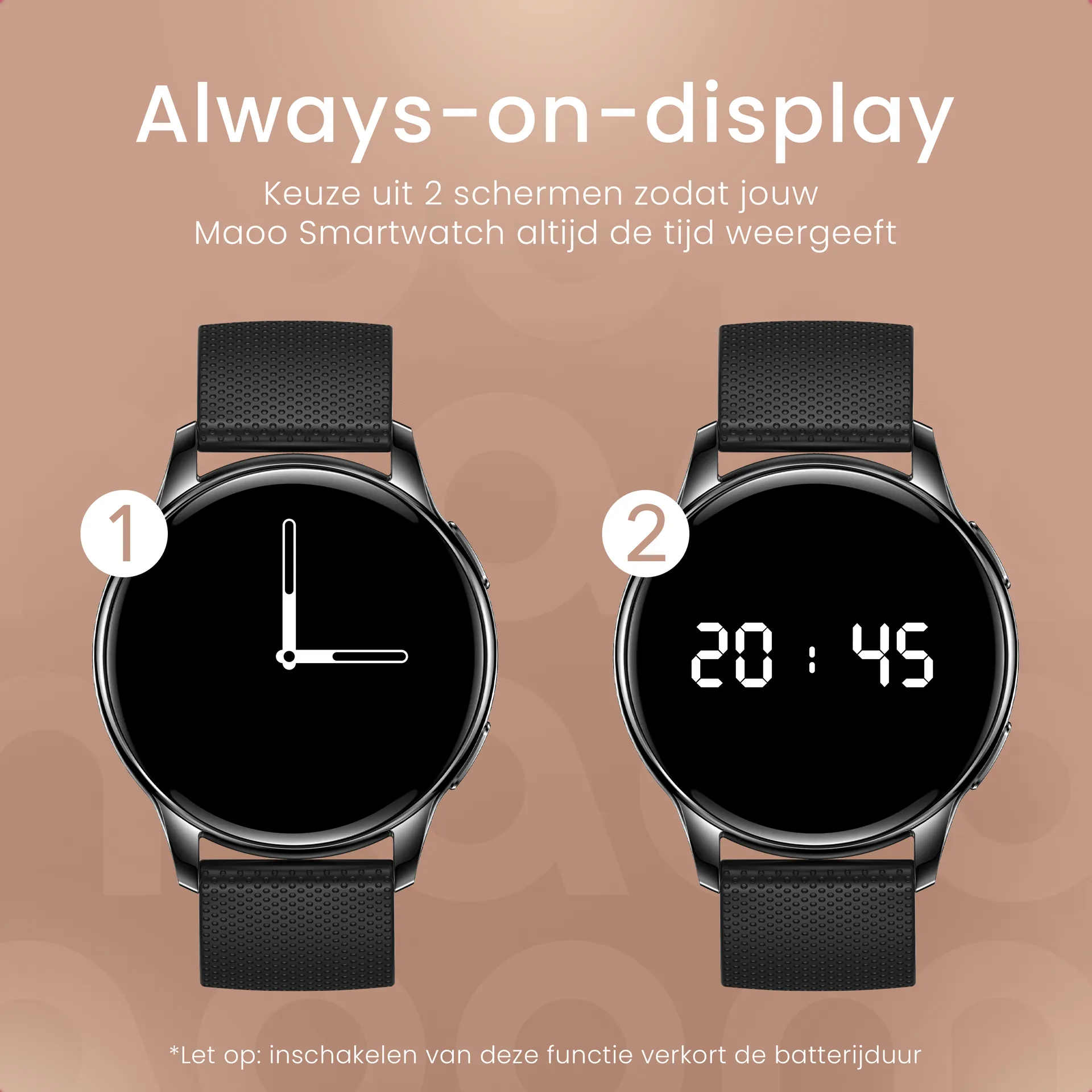
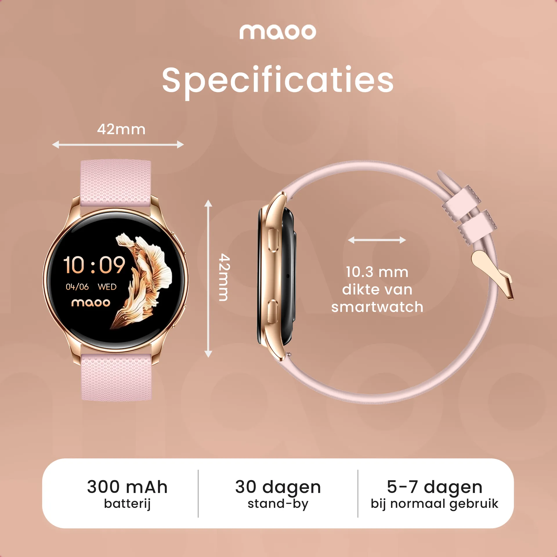
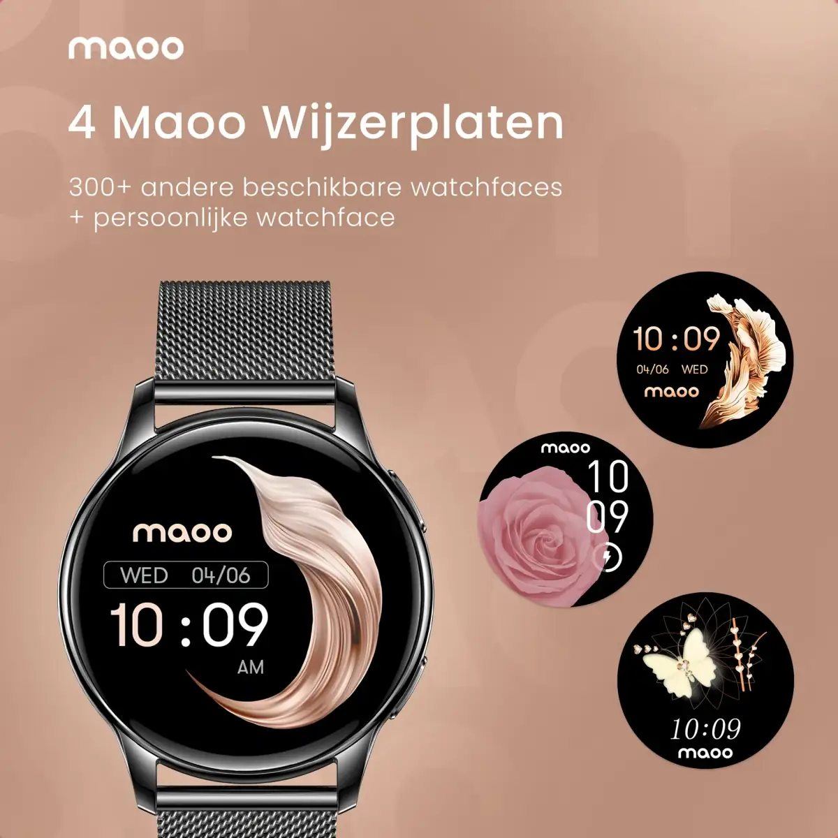
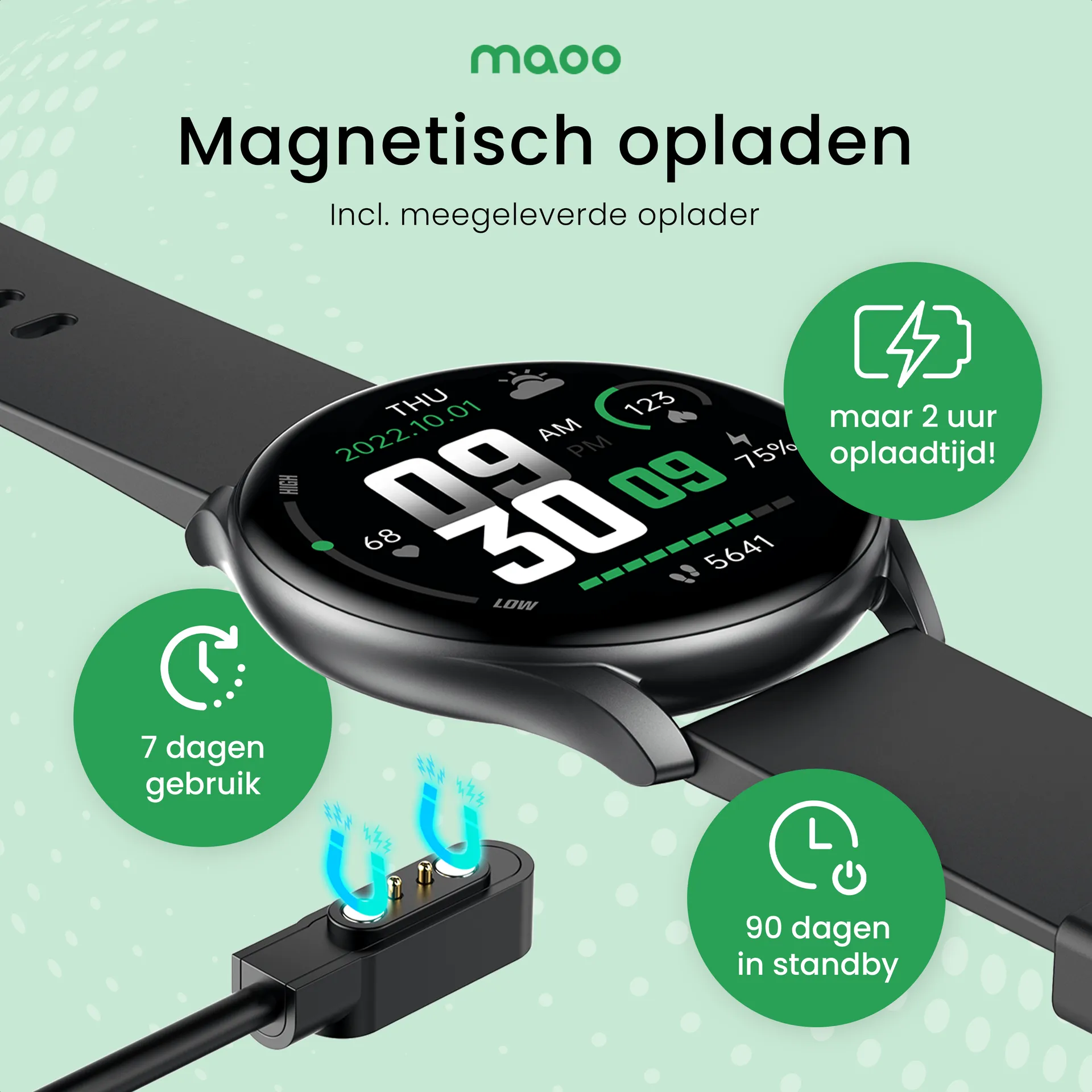
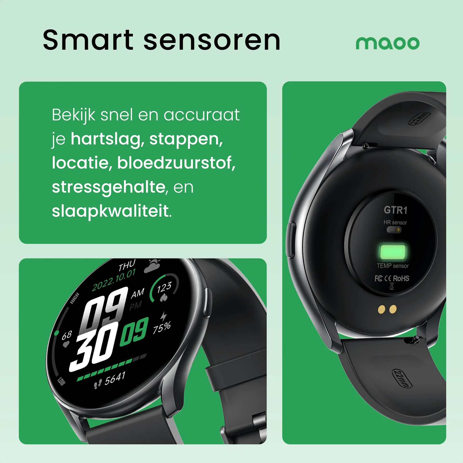
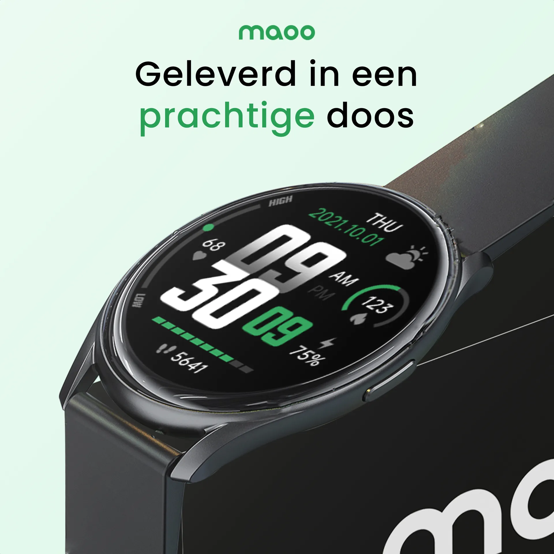
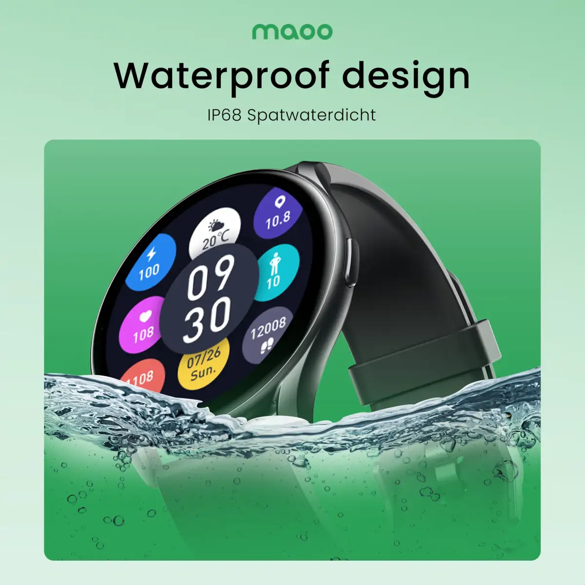
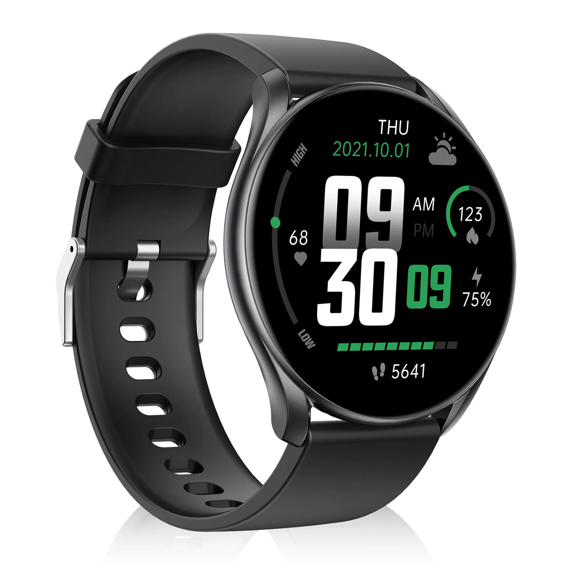
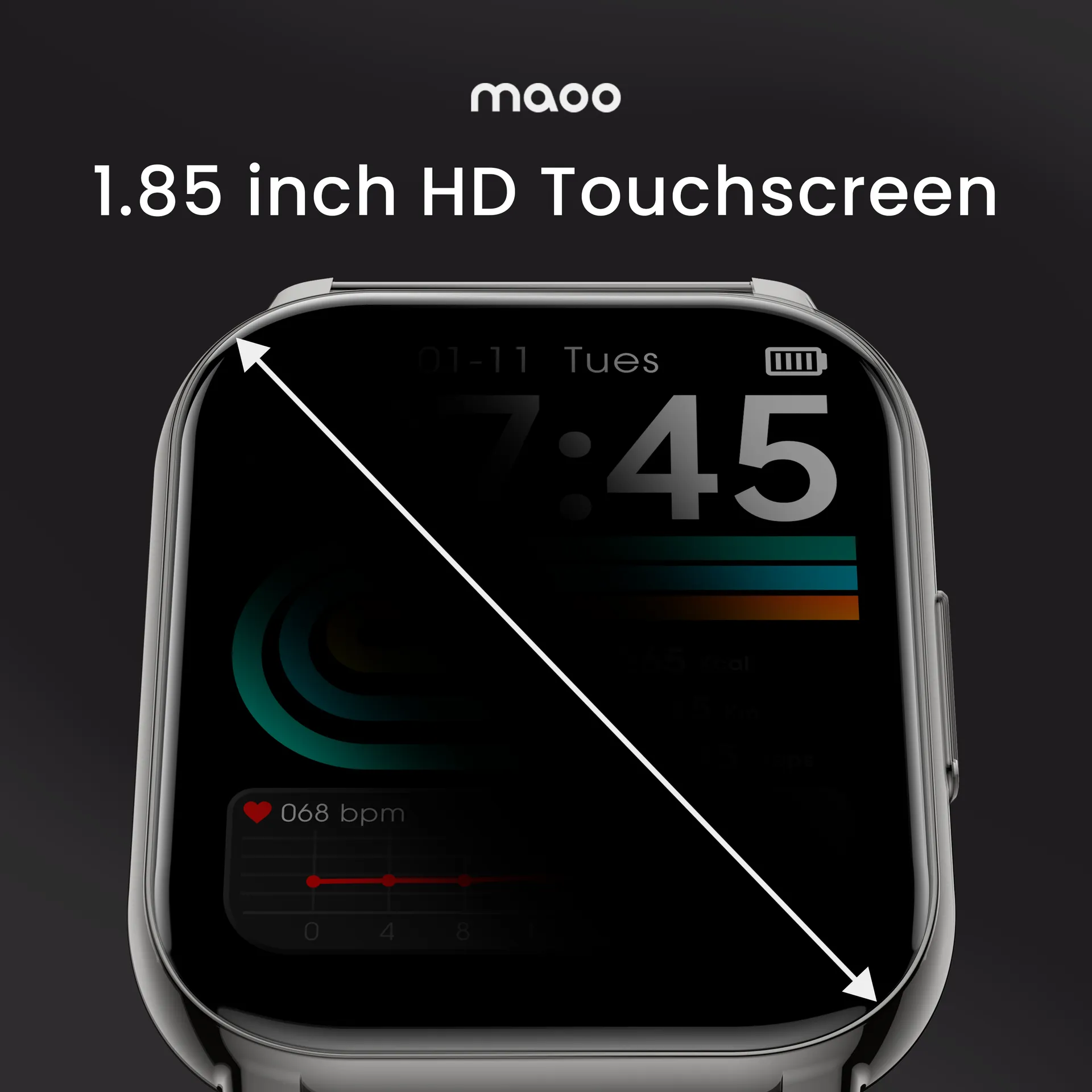
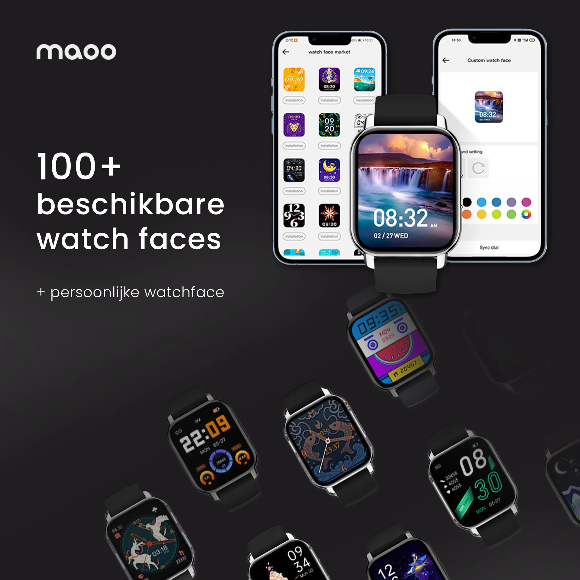
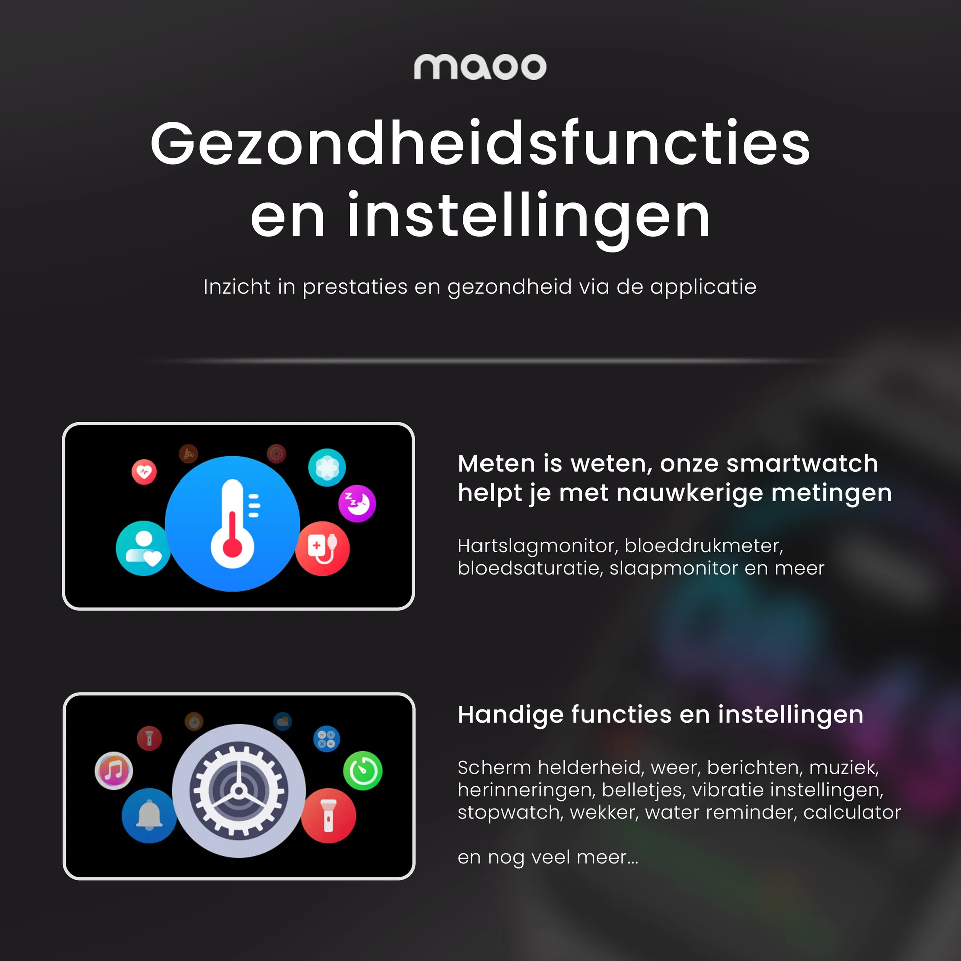
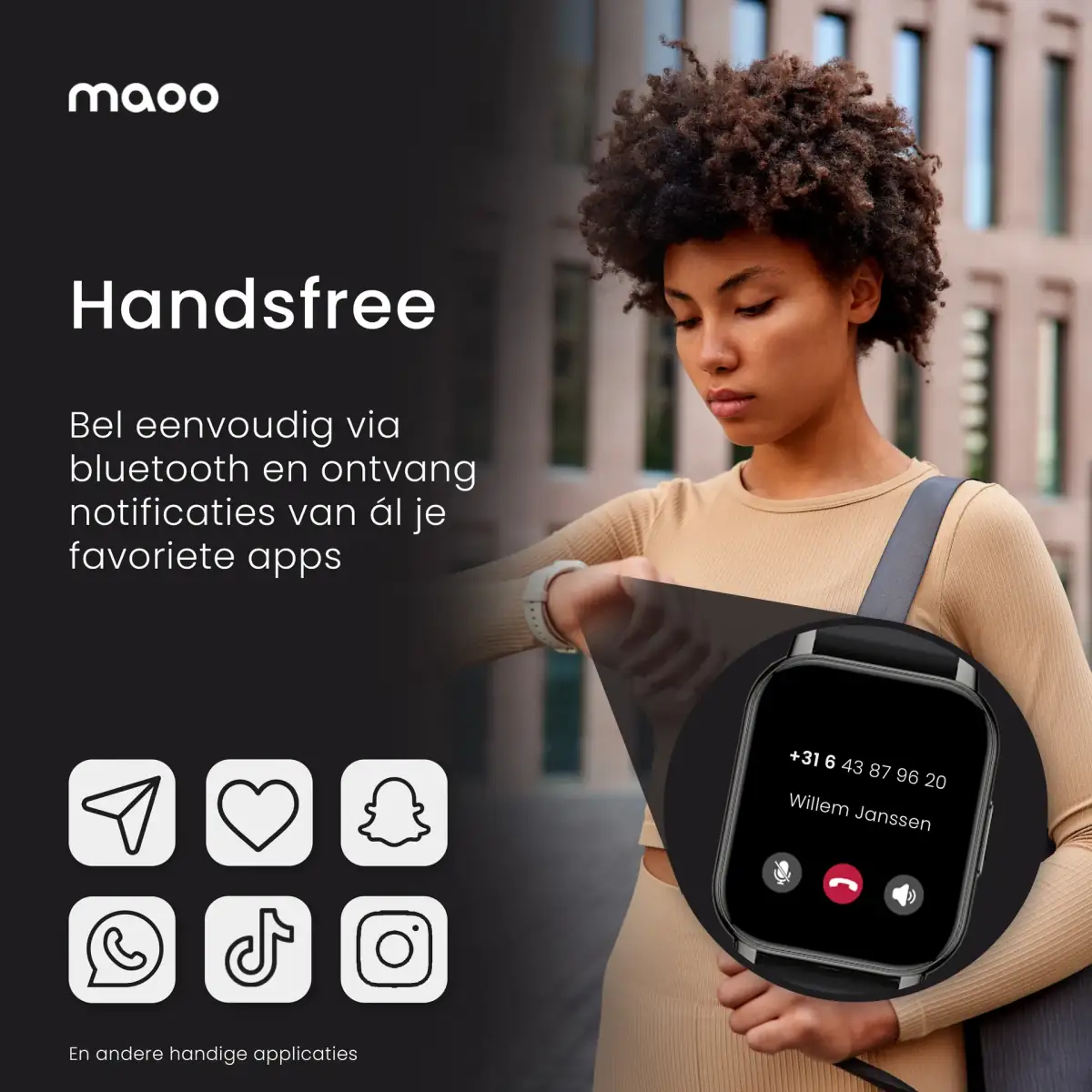
For Maoo we delivered the complete branding (logo, colour palette, typographic system, brand book) and product listing design for both Bol.com and Amazon. Per watch model the full listing suite: a main image that stands out in search results, lifestyle shots that show the watch in context, infographics that highlight the key features visually, and A+ Content on Amazon that carries the brand story.
The listing templates were designed to be reused for future models. Every new smartwatch Maoo launches can have a complete listing suite delivered within five working days, without us rebuilding the visual system each time.
The result
Maoo dominates the smartwatch niche with a visual line that stands out among competitors' generic listings. Every new launch carries the same identity through, which makes the brand stronger instead of thinner. The listings we set up three years ago are still running without looking dated next to newer competitor listings.
That is the real proof of good listing design: it holds up for years without rework. For brands selling in commodity-like categories a strong visual difference is the primary sales instrument, and Maoo shows that a considered approach makes a measurable difference in both algorithmic ranking and conversion per impression.