Optimice
Rebranding and 3D animation for a growing wellness brand
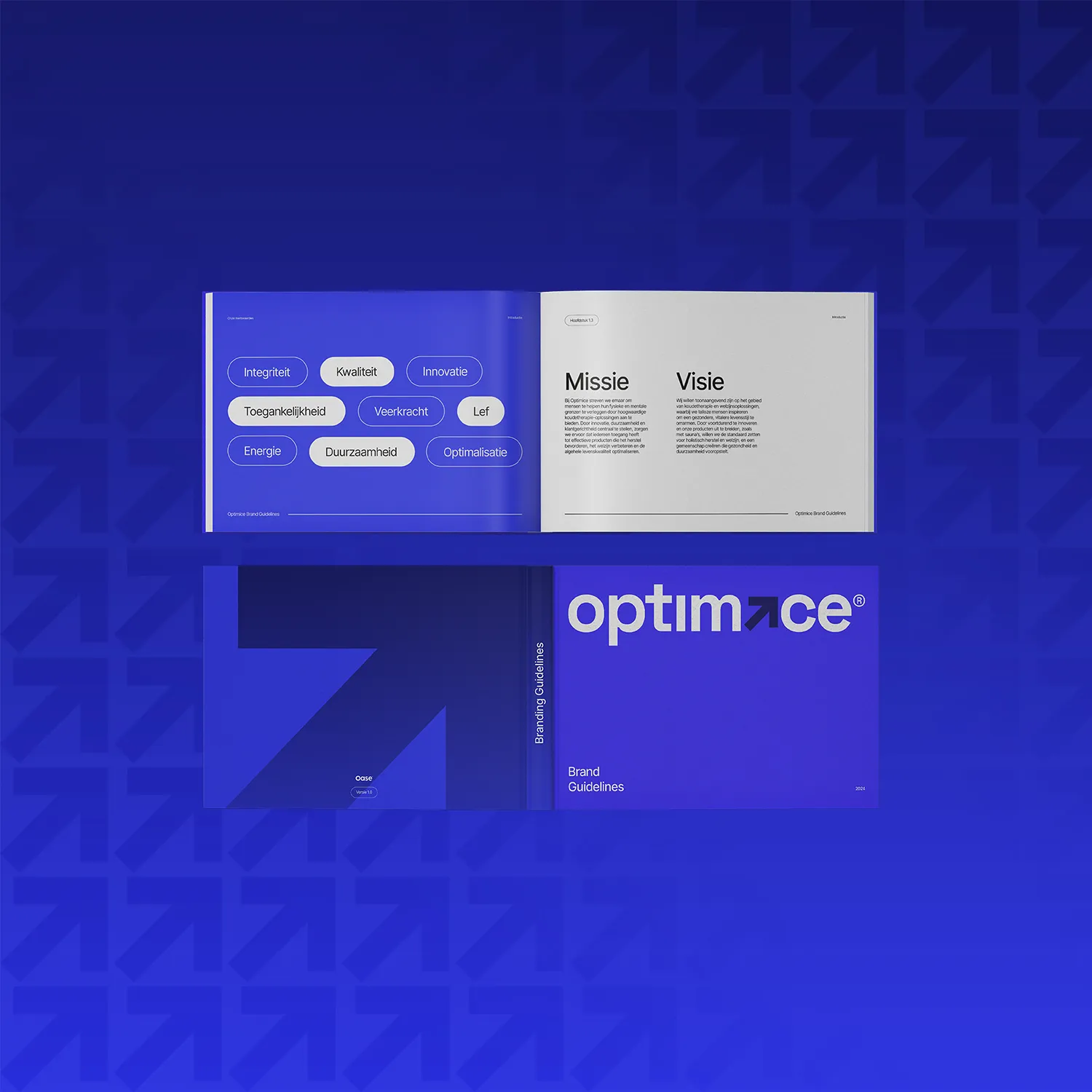
The Optimice rebrand: from a dated ice bath brand to a full wellness system with photography, listings, 3D animation and e-books.
optimice.com ↗The rebrand gave the brand a new direction without losing the recognition it already had. Name and colours stayed, but the visual line was sharpened and carried through to every touchpoint.
The brief
Optimice had an existing brand that felt dated. They started with ice baths for the growing cold exposure trend and later expanded into nose strips and mouth tape. The identity had grown along with them but without a coherent system, and it had become clear that the current visual line no longer pulled the audience the way it should.
The brief was specific: rebrand without giving up recognition. The name and the familiar colours had to stay, because customers who knew the brand had to still recognise it afterwards. Everything else was open. Typography, photographic style, listing design, packaging, all of it rebuilt inside a coherent new frame.
Our approach
We started with positioning. What is Optimice really: an ice bath brand that sells a few extra products, or a wellness system that offers ice baths alongside other recovery tools? The answer decided the whole rebrand strategy. We chose the wellness system as the overarching story, with the product lines filling it in.
The new visual line was developed around a more grown-up, calmer feel that suits a long-term wellness investment rather than an impulse buy on trend momentum. The palette was refined inside the existing recognisable main colour, the typography became more composed and authoritative, and the photographic style moved away from lifestyle towards showing the product inside a routine.
What we delivered
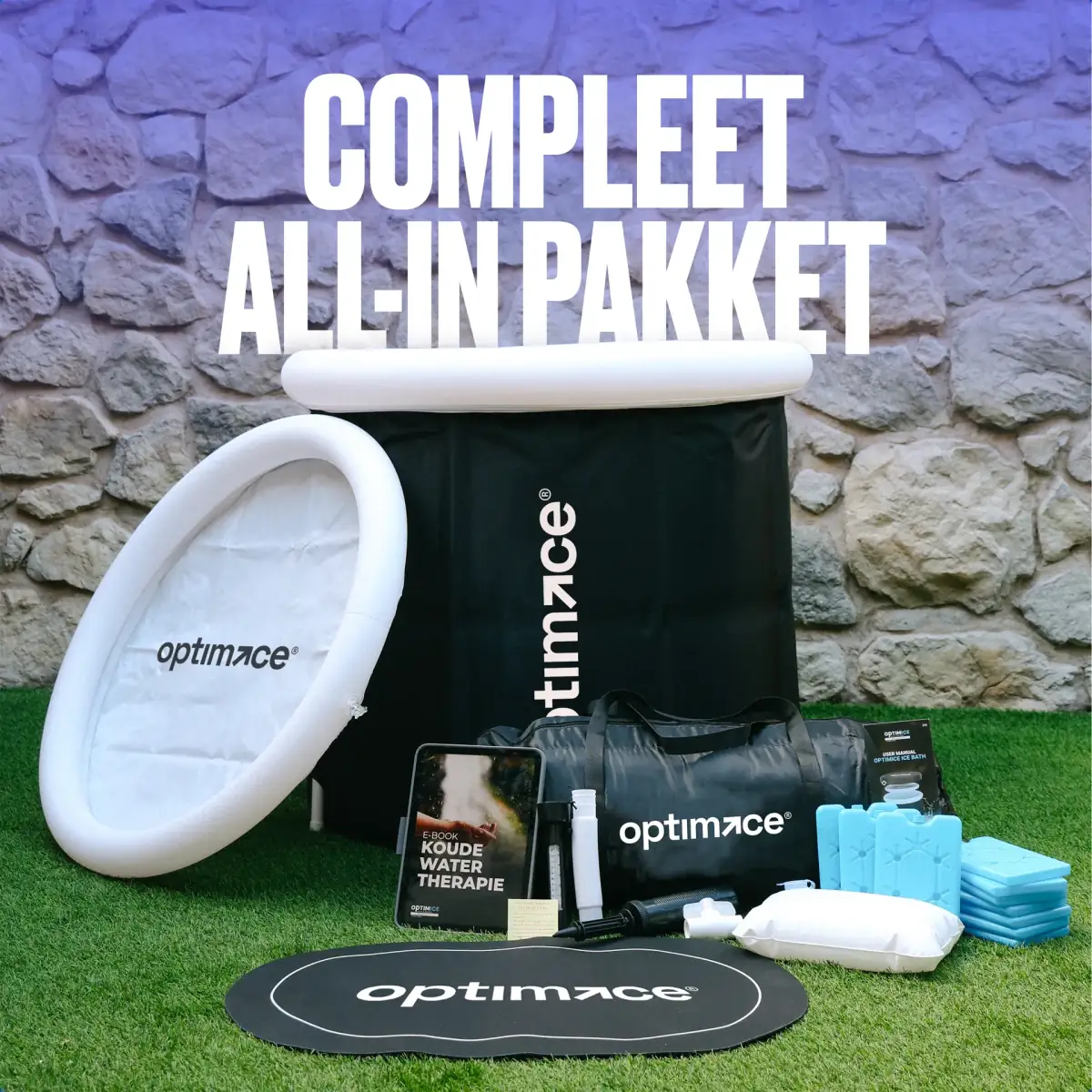
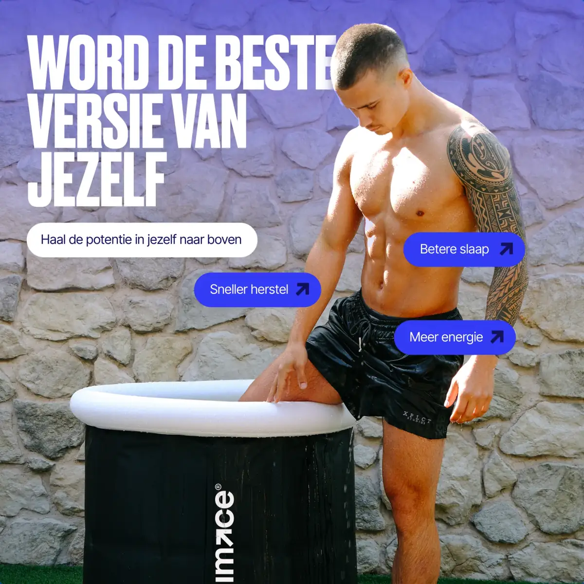
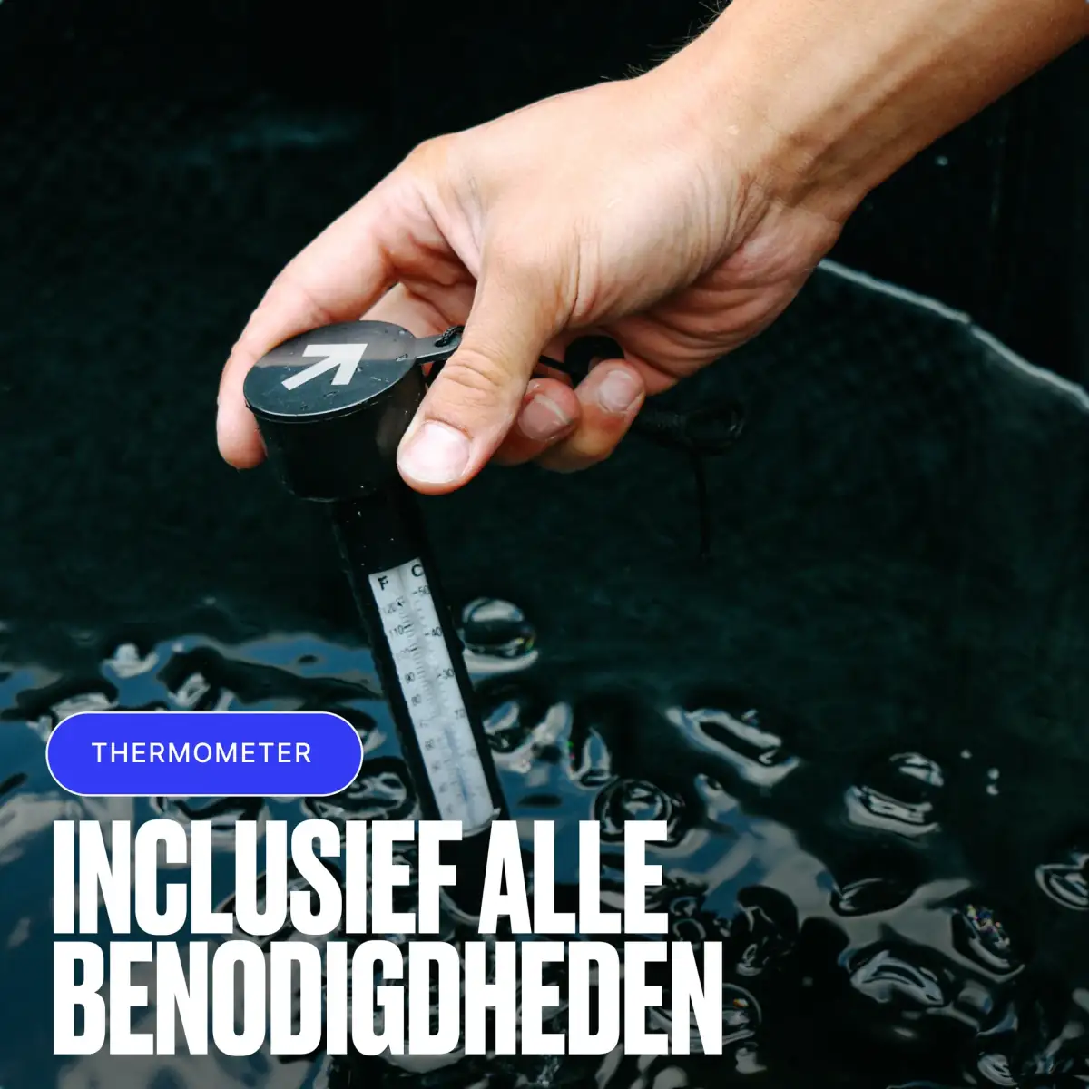
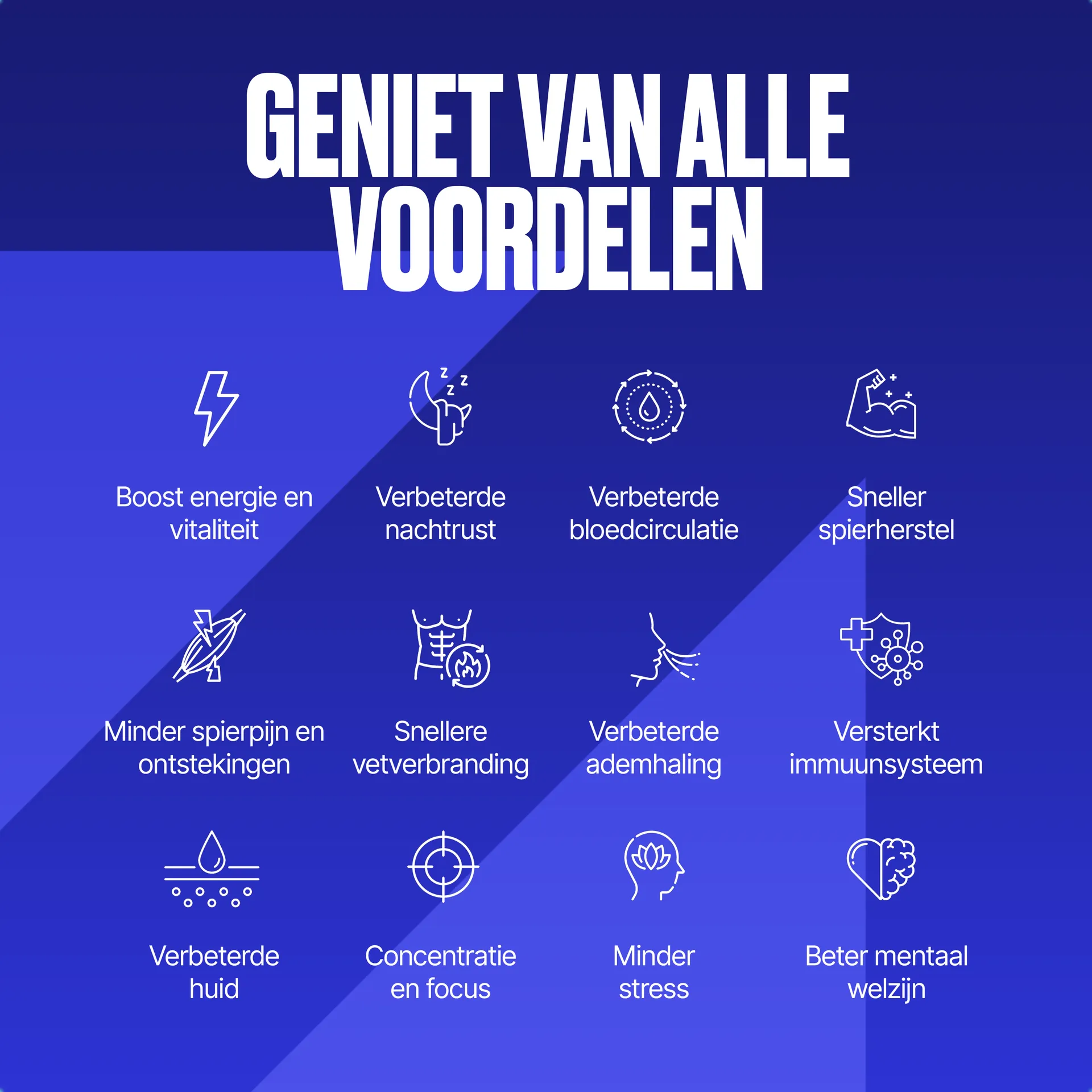
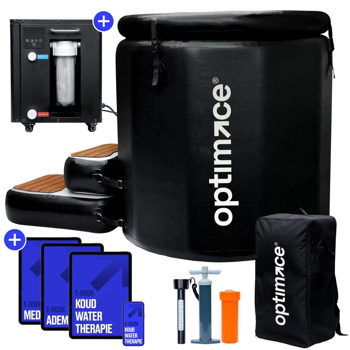
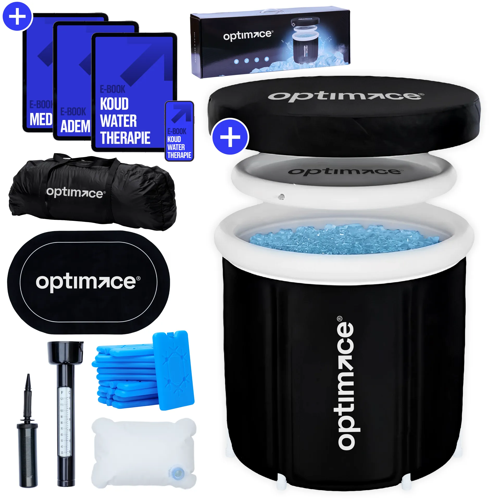
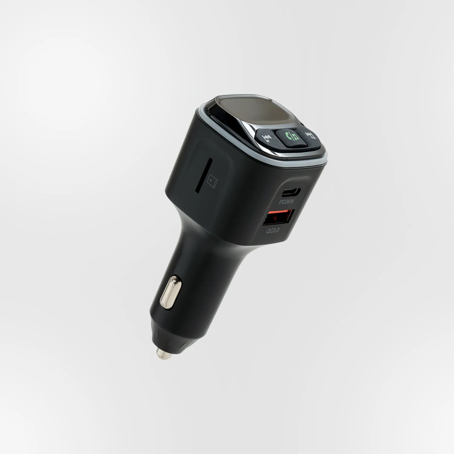
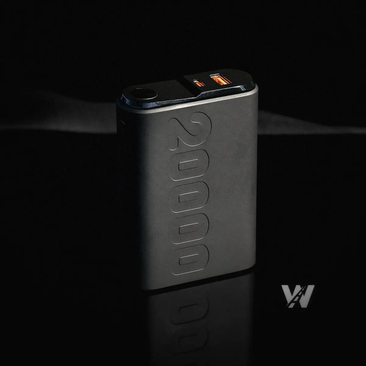
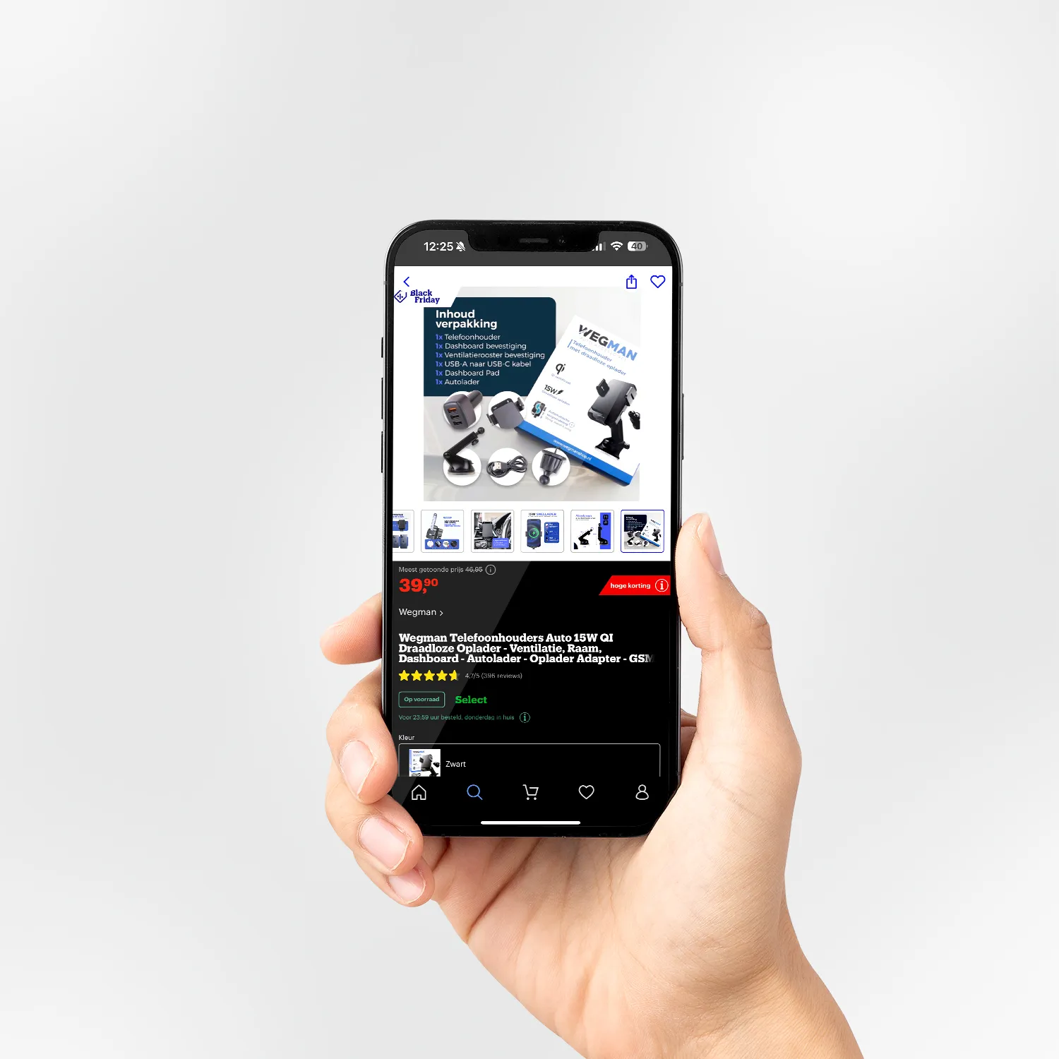
For Optimice we delivered a broad package: the complete rebrand including a brand book, product photography of the whole line (ice baths, nose strips, mouth tape, accessories), lifestyle photography showing the products in real use, product listing design for both Bol.com and Amazon, product documentation and manuals, marketing e-books on cold exposure and sleep optimisation that work as lead magnets, and 3D spinning animation for the Shopify store.
The 3D animation is a conversion tool: hover over a product in the store and it turns slowly with realistic lighting. For wellness products where tactile quality is hard to carry across in static images, the rotation gives a sense of holding the product that lifts conversion measurably.
The result
The 3D spinning animation brings the products to life in the store. Combined with lifestyle photography that shows them in context, you build a brand experience that goes past a product page. Optimice shows that a rebrand does not always mean starting over. Sometimes sharpening, extending and carrying it through consistently is what makes the difference.
For brands considering a rebrand but afraid of losing the customer base they have, Optimice is a reassuring example. You can fundamentally change what you project without giving up recognition, as long as you keep the main elements (name, colour) intact and make the change in the execution rather than in the identity itself. That is a different conversation from a complete rebrand from zero.