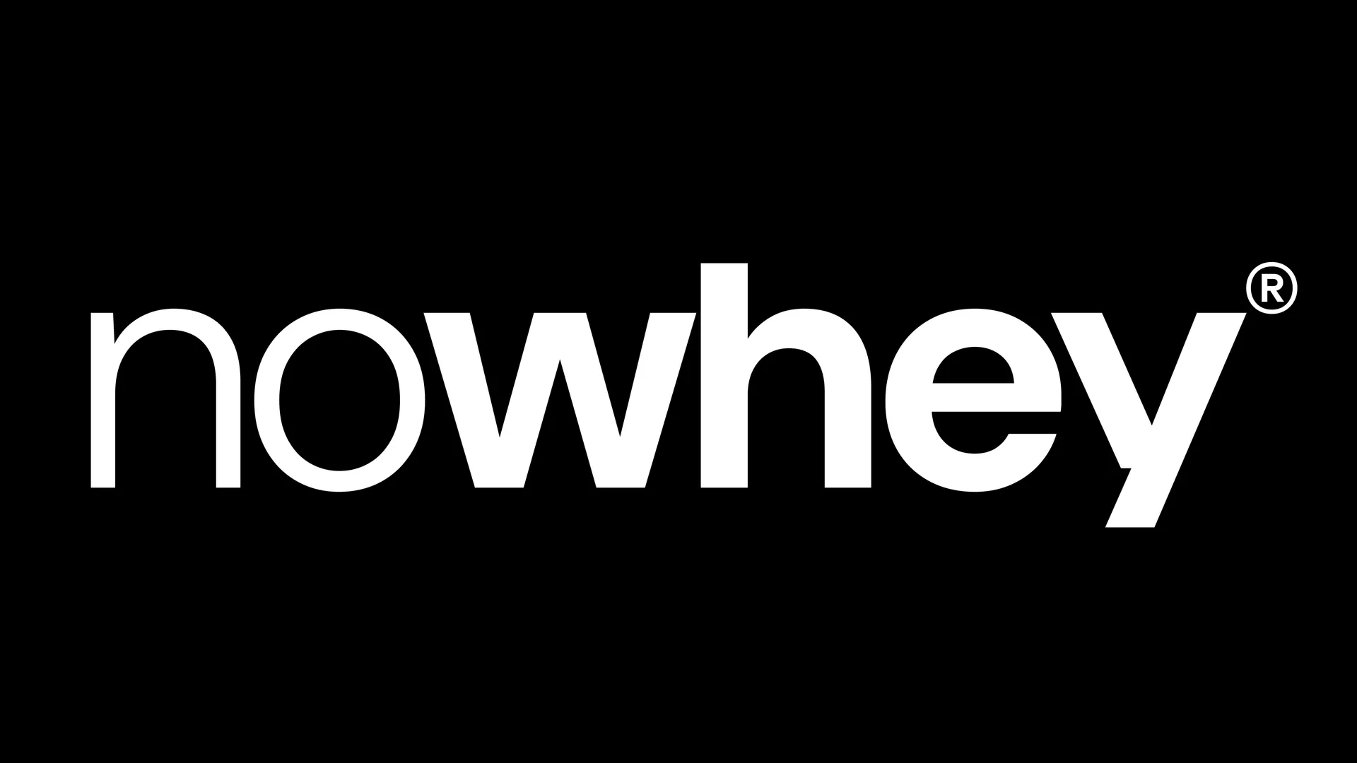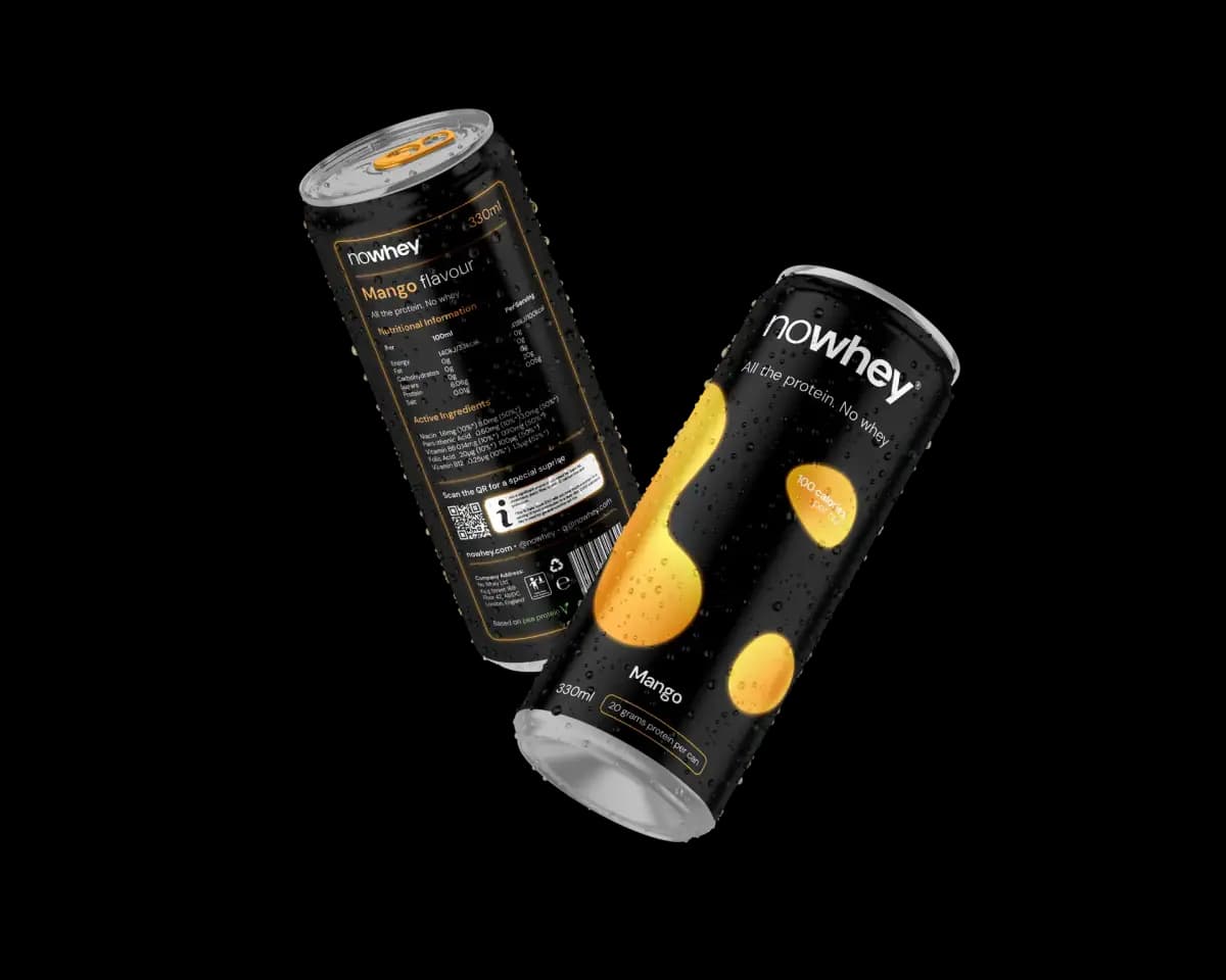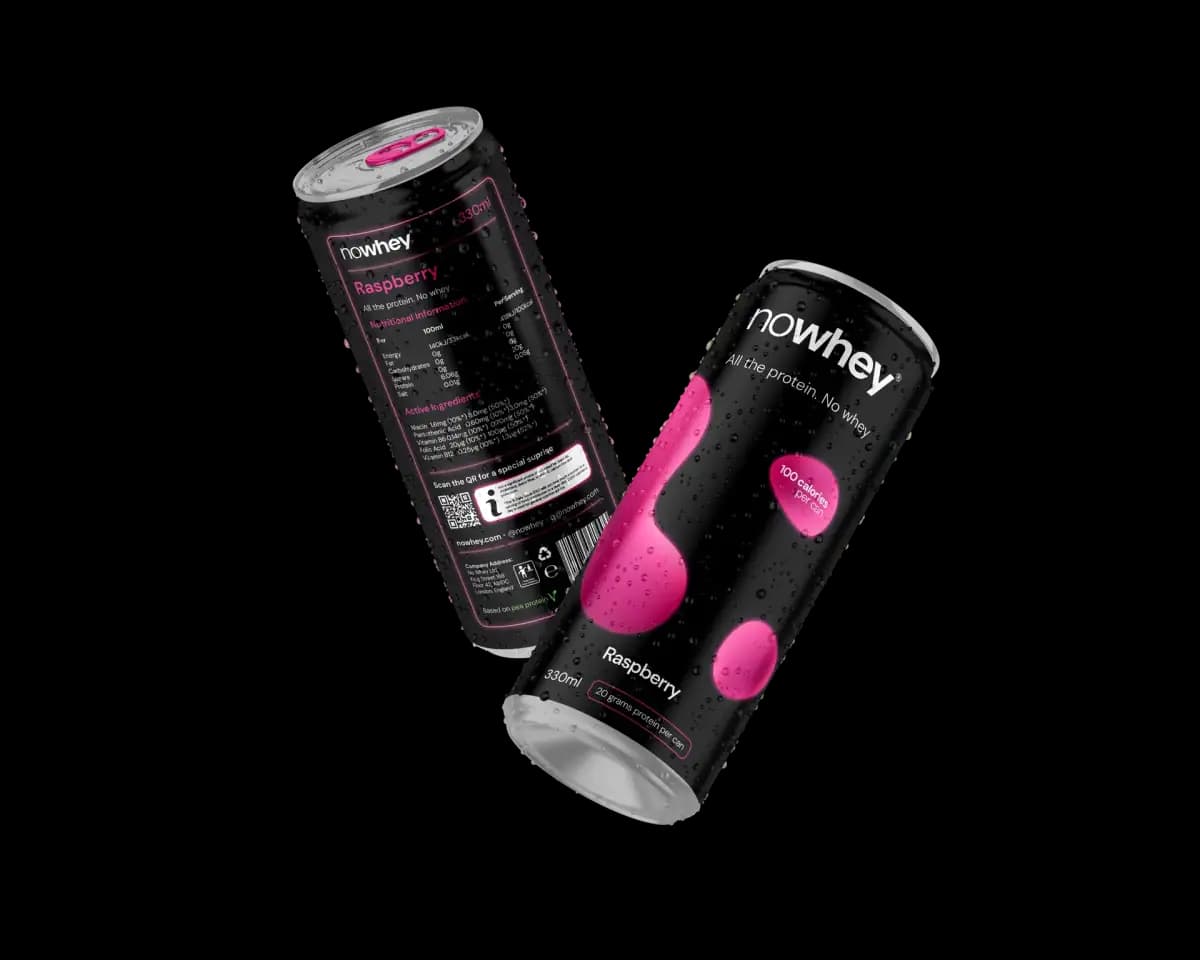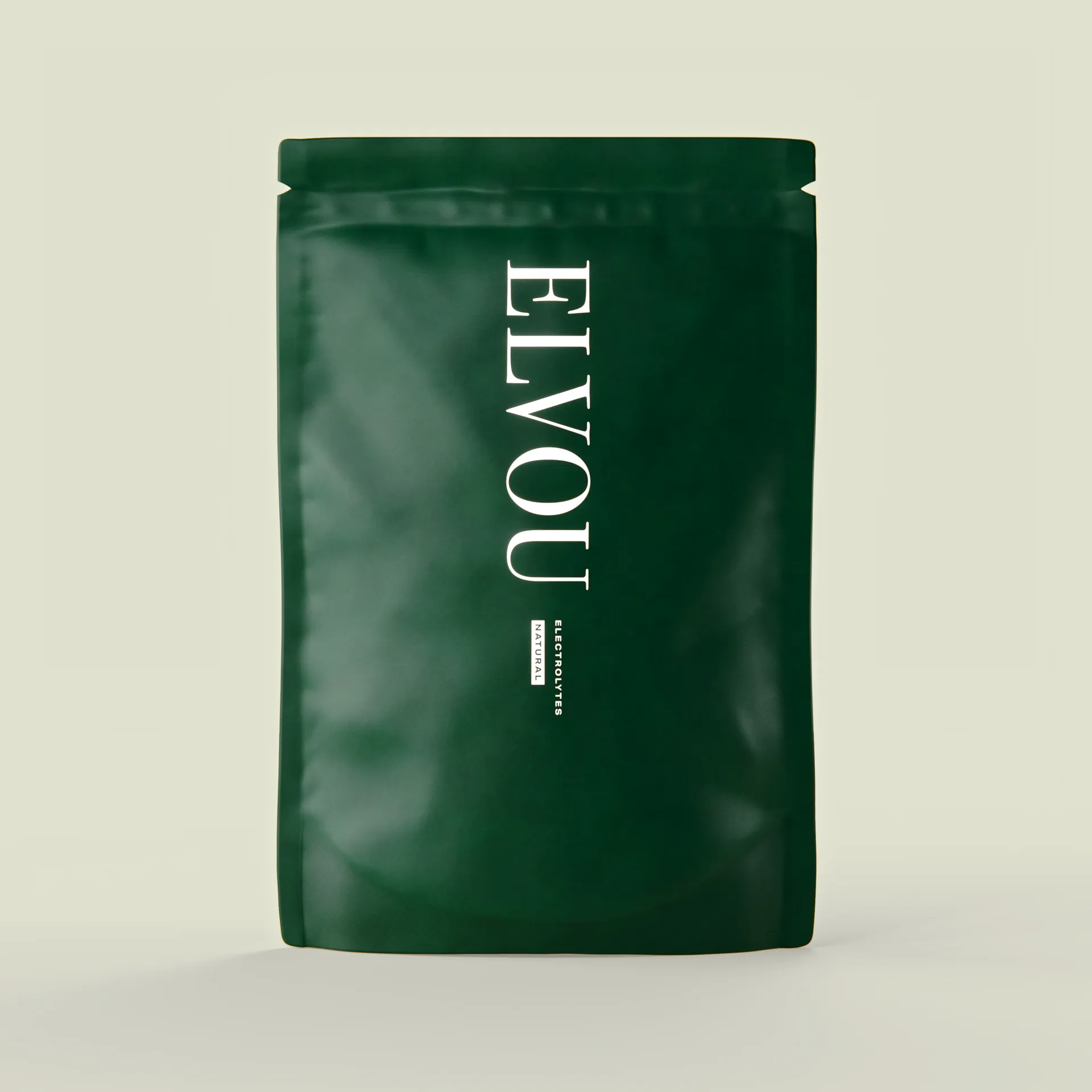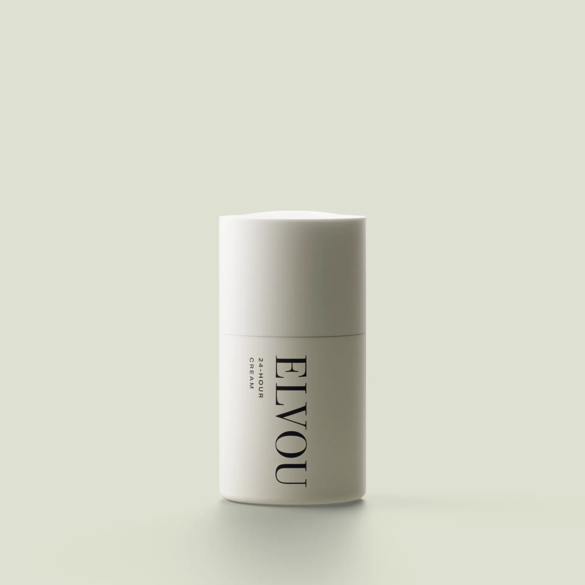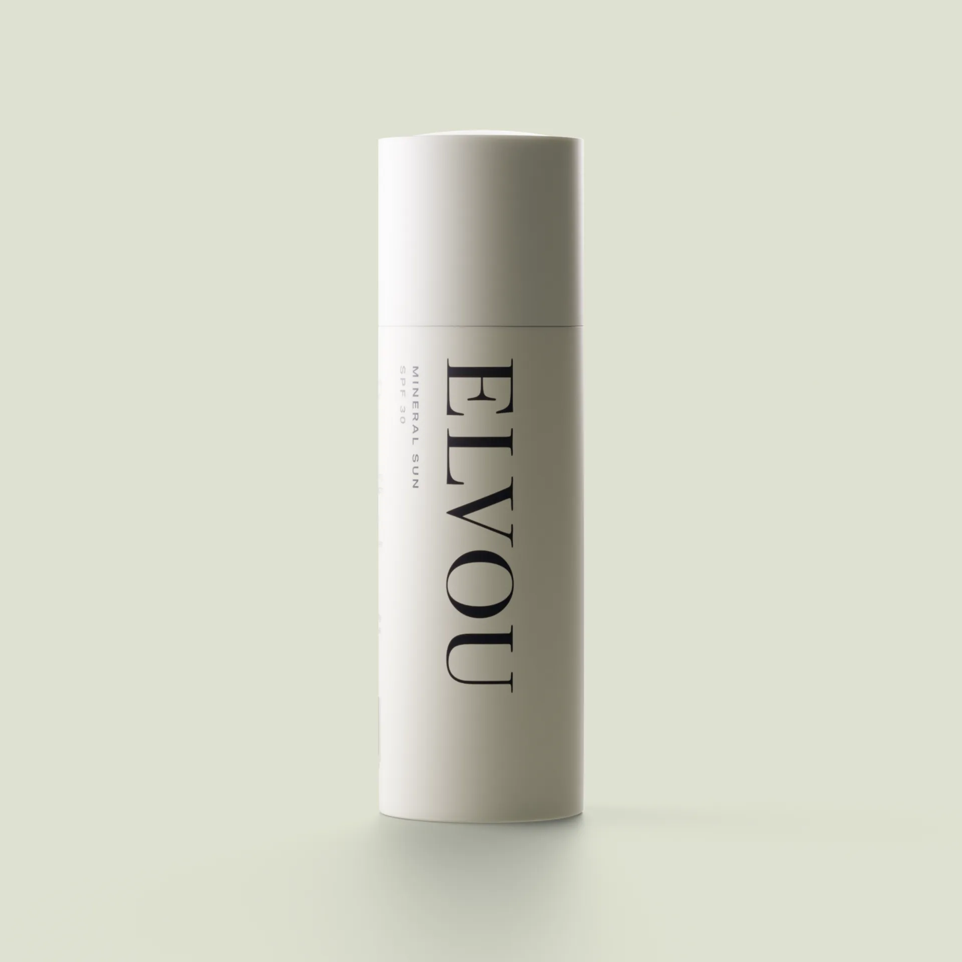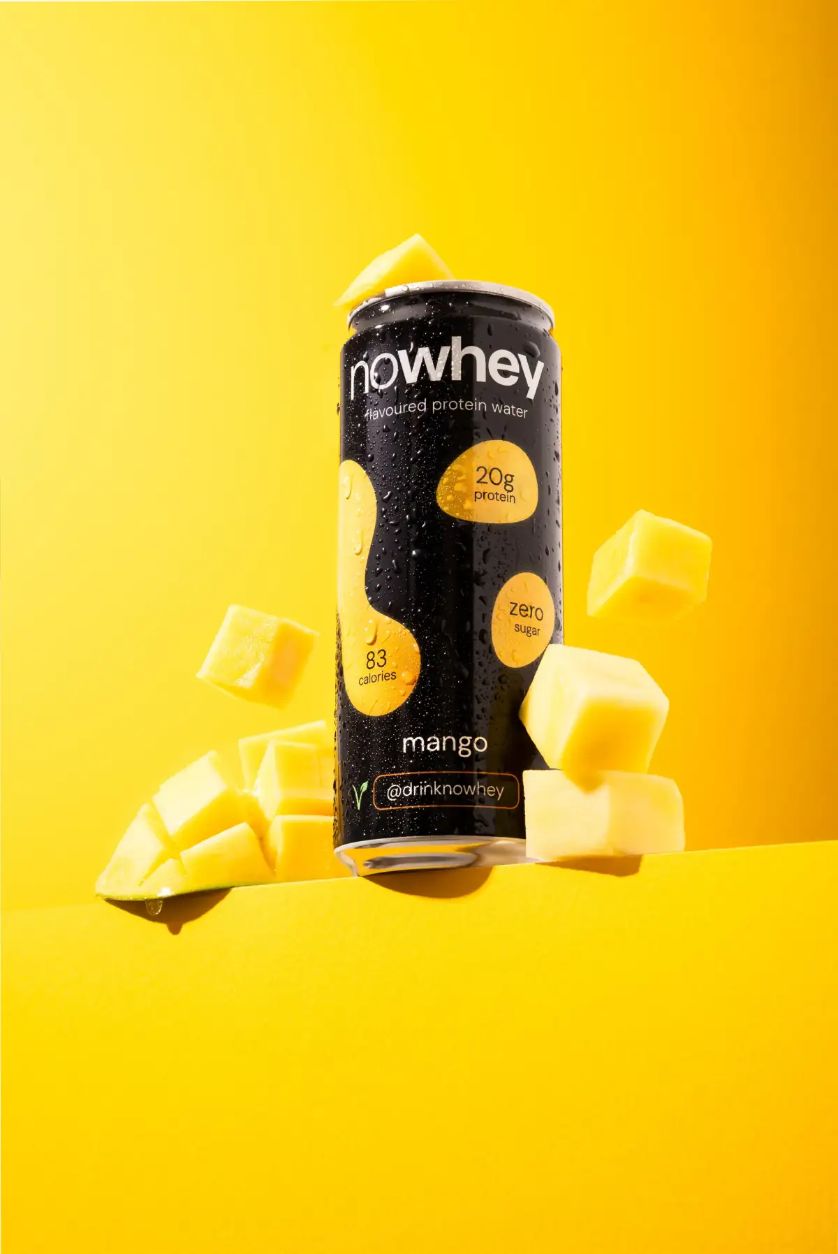
Nowhey is a UK-based pea protein brand working internationally. We designed the logo and the complete packaging design.
nowhey.com ↗An international brand needs a visual identity that works in every market. Not a typically Dutch look, but a clean, recognisable design that sits as well on a shelf in London as in a store in Berlin.
The brief
Nowhey is a pea protein brand based in the United Kingdom and active across several international markets. The brief had two parts: design a logo that fixes the positioning of the brand (plant-based, modern, without the hippie cliches of so many plant-based brands), and build a packaging system that scales across the whole product line and works in every market without cultural adaptation.
The specific challenge in protein is saturation. Dozens of brands in every market, comparable products, comparable claims, comparable price points. The difference sits purely in how the brand reads at the moment someone stands in front of the shelf or the product page. For a new brand in this category the first visual impression is make or break: get it wrong and you never sell, get it right and you get a fair chance.
Our approach
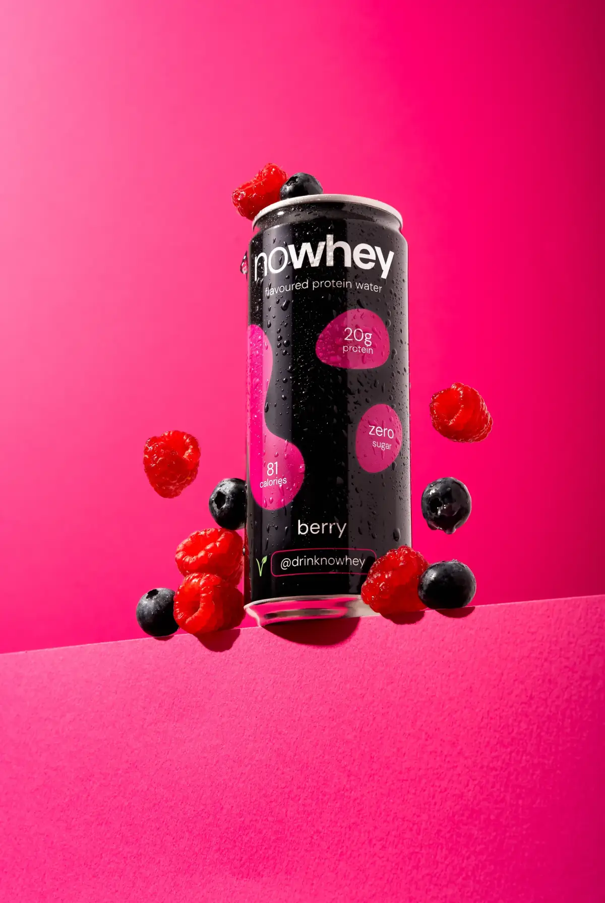
We analysed the protein market to map the visual cliches. Tropical leaves, oversized type, neon green, loud claims about sustainability. Then we did the opposite: a restrained palette, classical typographic proportions, subtle plant-based signals that do not shout. The positioning became: a serious product for serious athletes, with plant-based as a fact rather than a sales pitch.
For the packaging system we designed a scalable structure where the flavour variant reads clearly, but where brand consistency stays the strongest signal. Customers trying a different flavour on their second purchase recognise the brand immediately. That is fundamental to repeat purchase in this category.
What we delivered
Nowhey got the complete brand package: logo with variations (primary, secondary, monogram, favicon), a colour palette with exact values for print and digital, a typographic system with guidelines, and a complete packaging structure for the whole product line. Per flavour a print-ready file with dieline and colour profiles for direct production. Plus a forty-page brand book that makes every future decision simpler.
The technical details are set up for international production. Pantone codes, material recommendations available at print suppliers in the UK, the EU and Asia, and compliance considerations for packaging regulation in the different markets where Nowhey is active.
The result
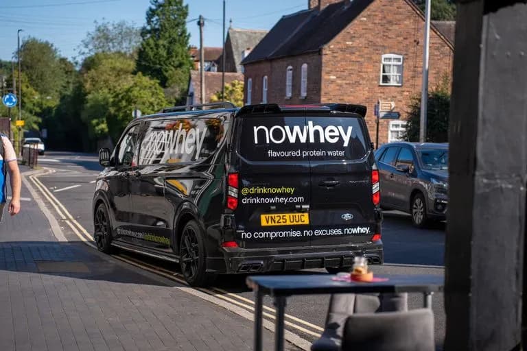
The packaging is designed to stand out in a crowded category. Protein is a competitive market. The difference does not sit in the product itself, but in how it reads at the moment someone chooses. That is where branding starts. For brands that want to scale internationally from launch, a packaging system that needs no market-specific adaptation is a real operational advantage.
For other brands in comparably saturated categories, this is a case showing that restrained design often works better than loud claim architecture. What is left when the marketing volume drops away is the quality of the design, and that holds up for years.