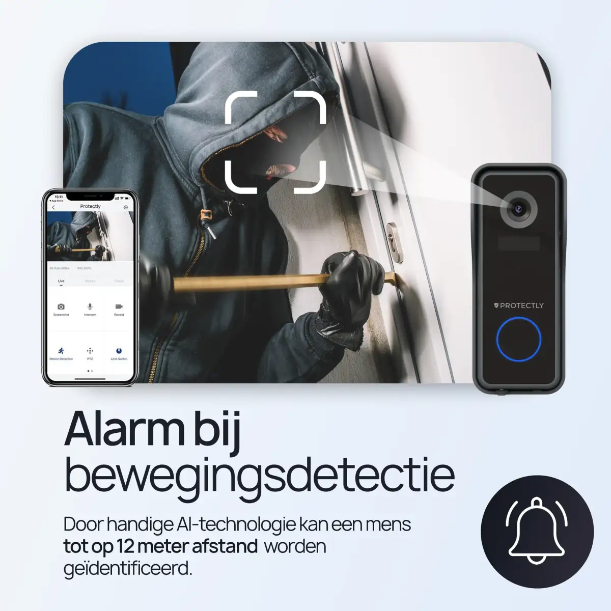
Protectly (safety) and Siltcon (game products): two brands, one client, two completely different niches on Bol.com and Amazon.
Two completely different audiences, but the same approach: listings that carry the right information and suit the category. Businesslike and compliant for safety products. Functional and outdoor-led for game products.
The brief
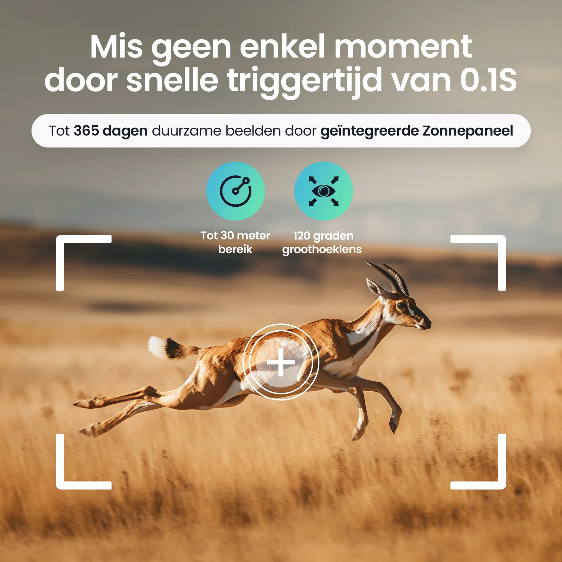
Protectly and Siltcon are two brands from the same client, specialising in entirely different categories. Protectly covers safety products such as fire extinguishers, smoke alarms and first aid kits. Siltcon covers game products such as trail cameras, feeders and hunting equipment. The brief was clear: produce the product listing design on Bol.com and Amazon for both brands, and make sure each category has its own visual language that suits its audience.
The challenge was not creative but operational. How do you keep two brands visually separate without the volume per brand making production inefficient? How do you make sure assets for one brand never start to look like assets for the other?
Our approach
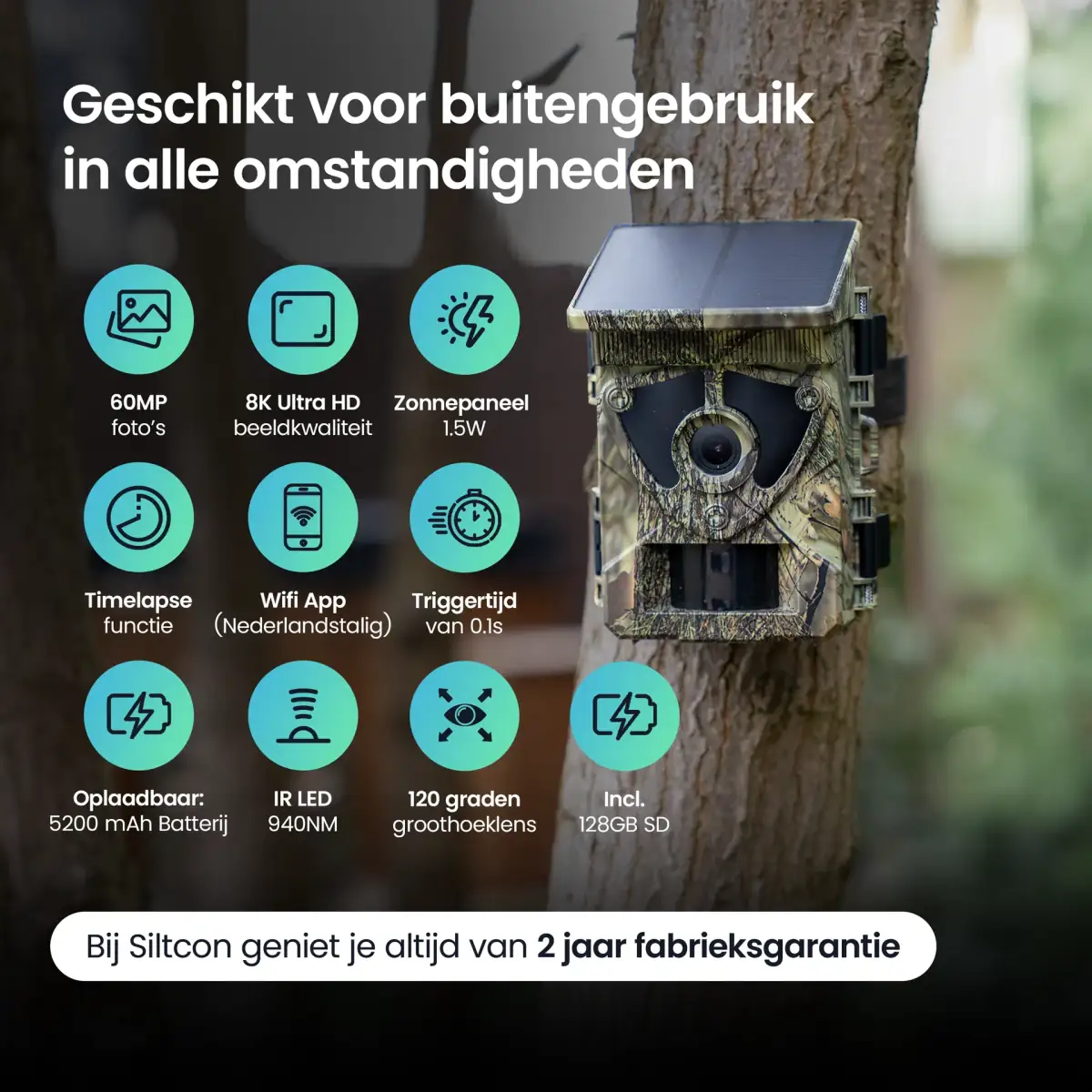
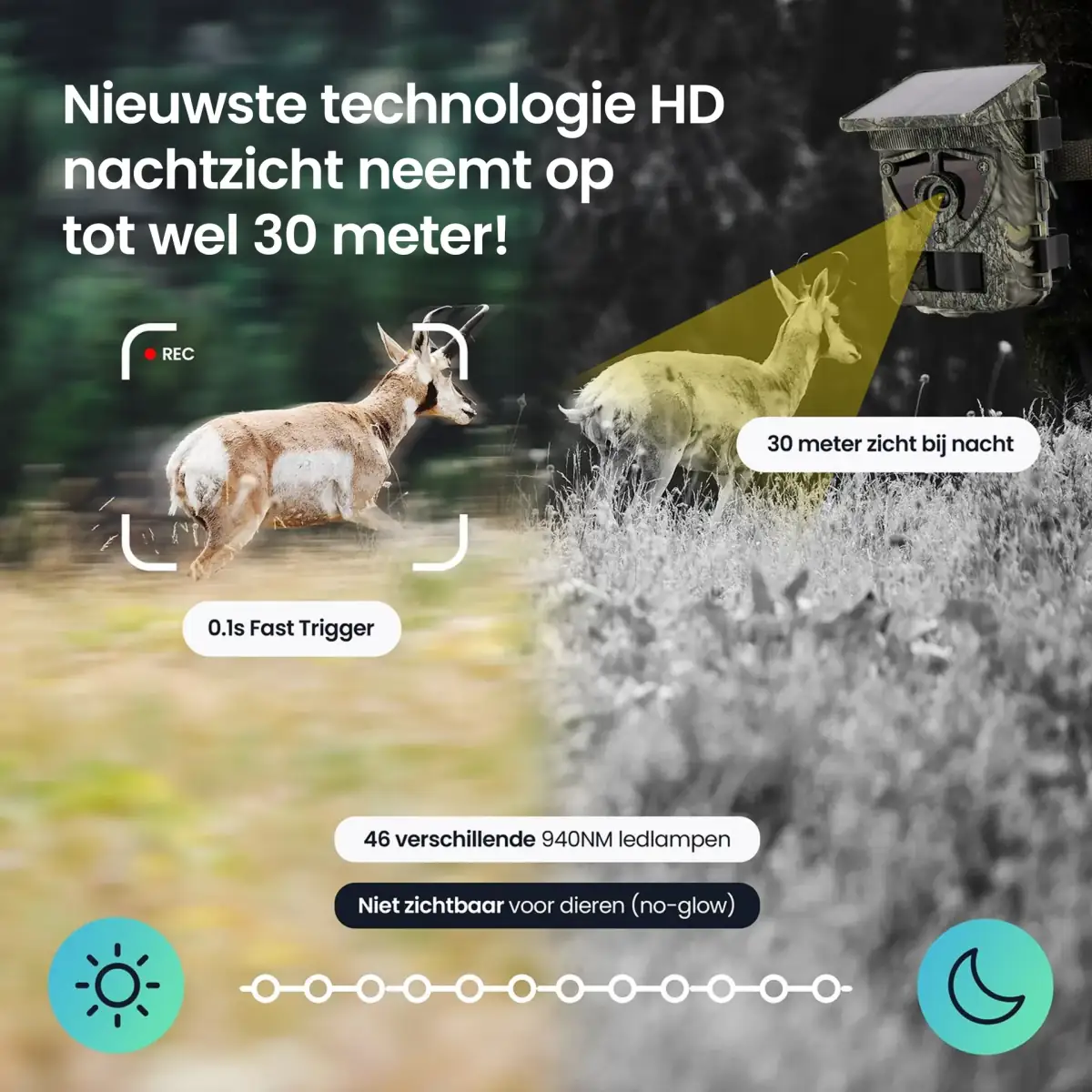
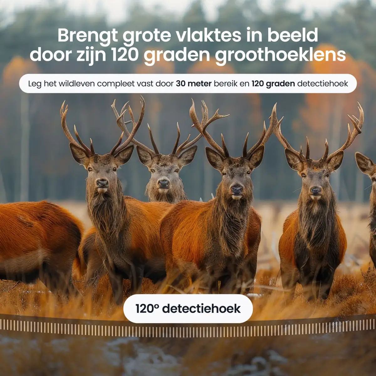
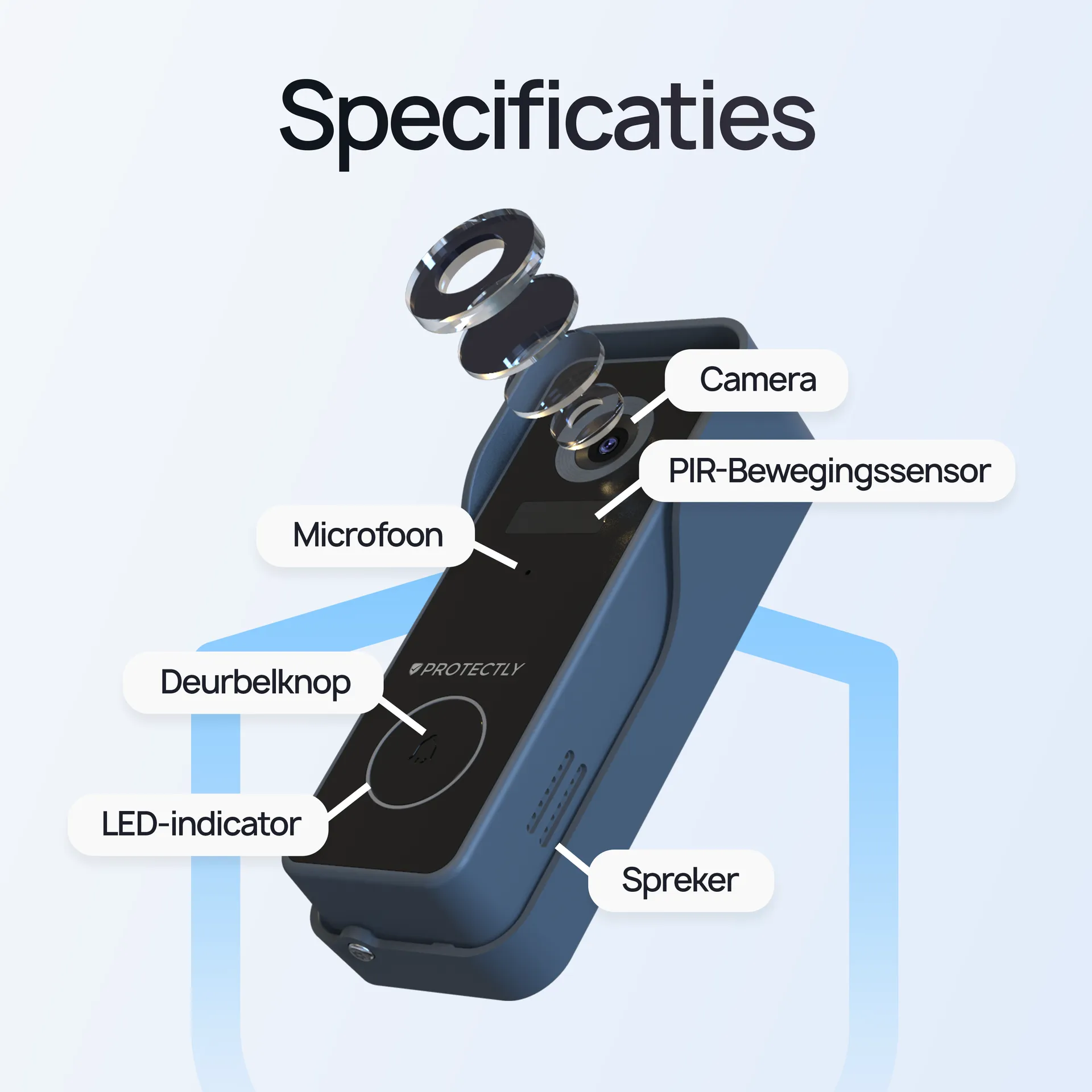
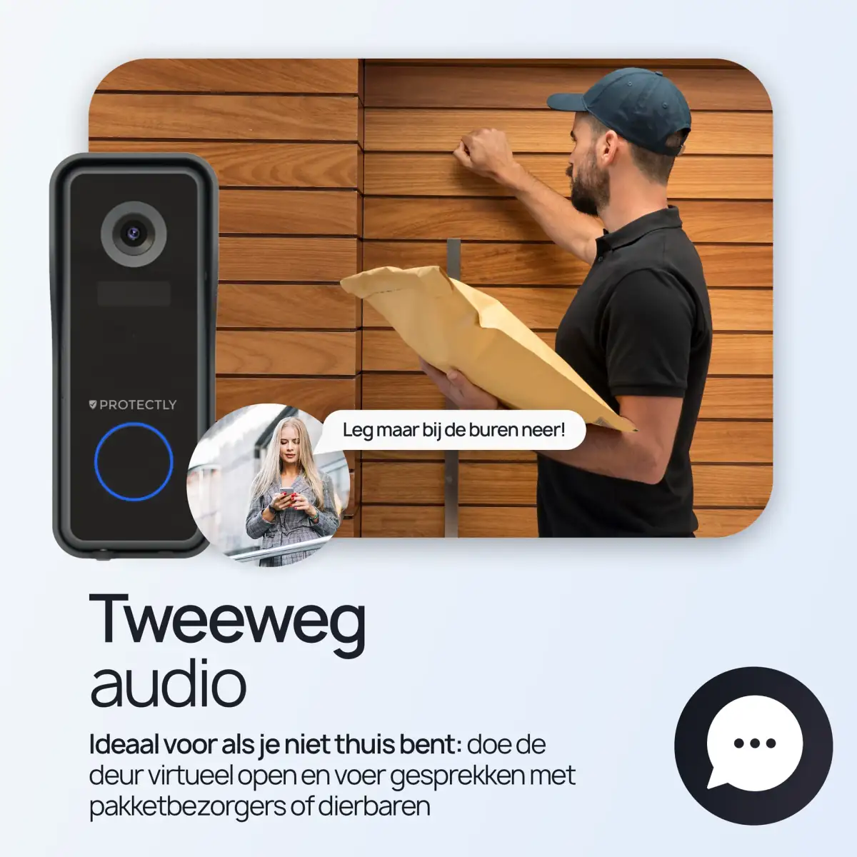
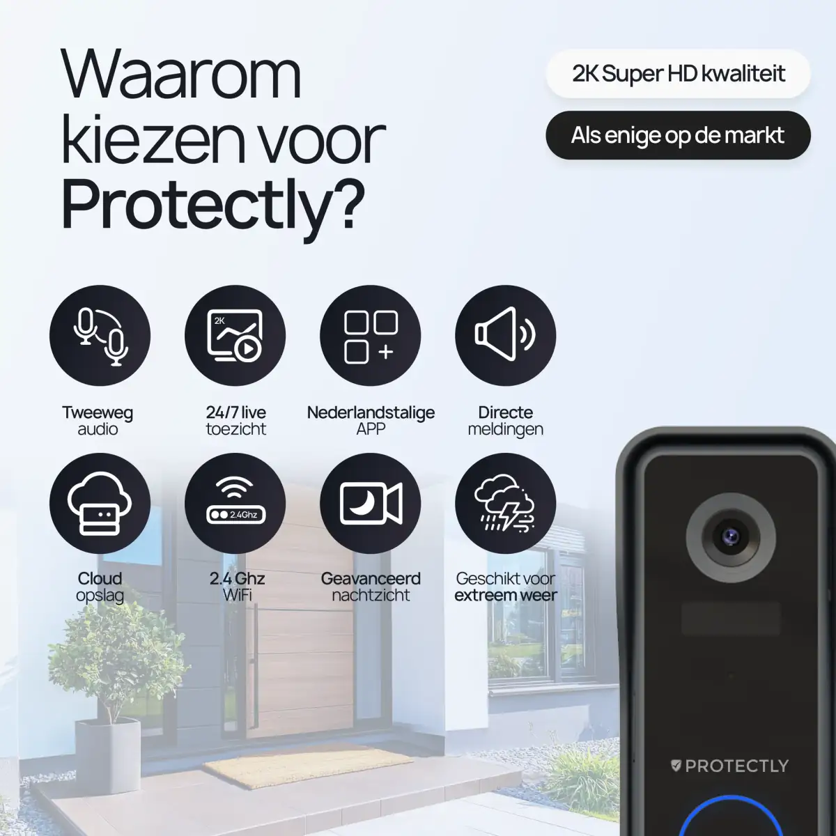
We developed separate visual guidelines for both brands and set them as presets in our production pipeline. For Protectly: a businesslike orange and black palette, heavy sans-serif typography that carries strength and reliability, clinical images of the products in working situations. For Siltcon: earthy greens and browns, robust typography with natural elements, lifestyle images of the products outdoors.
By fixing those guidelines up front, we stop our designers from accidentally mixing styles between the brands. Every listing is produced with the right preset active, and the quality check compares the output against the brand-specific guidelines.
What we delivered
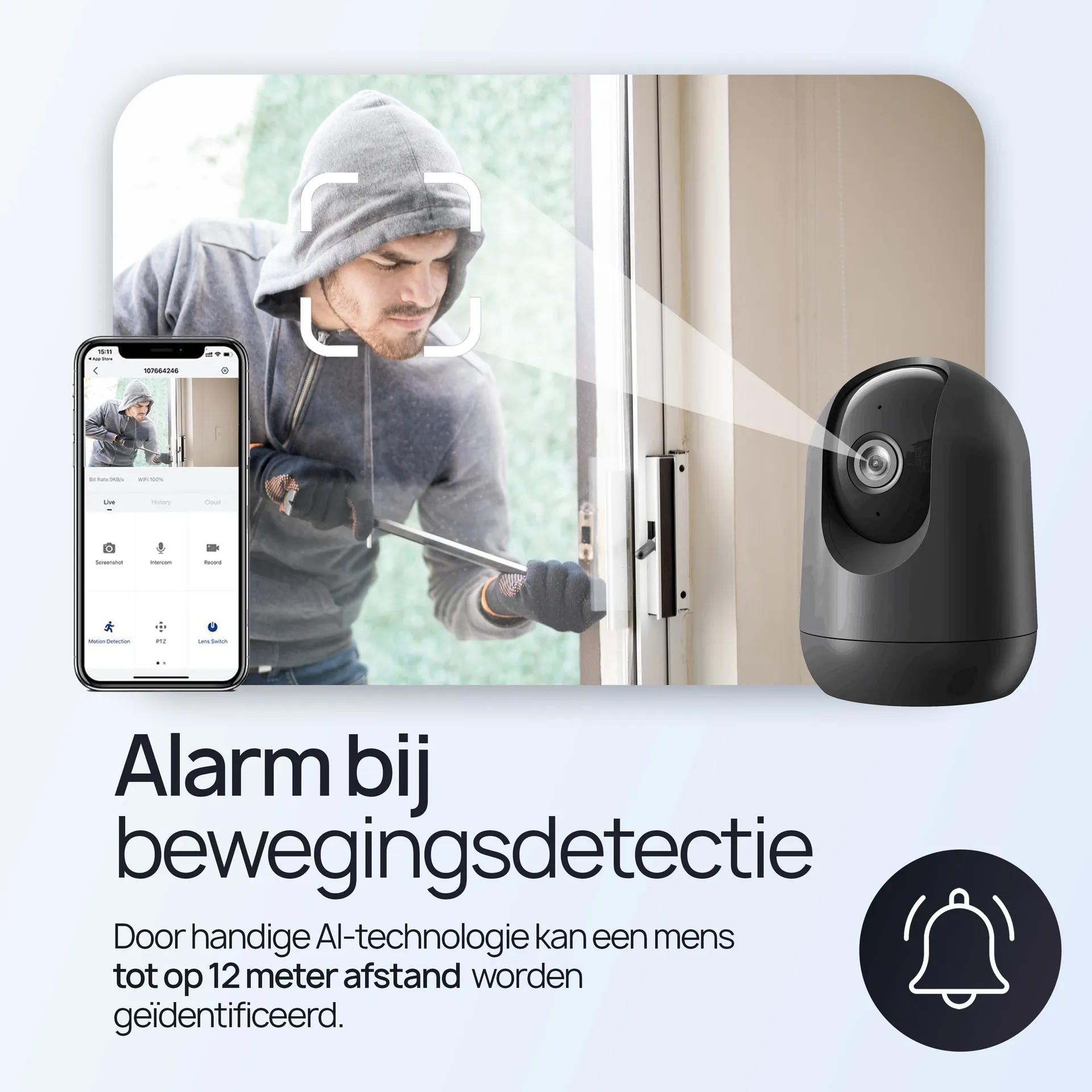
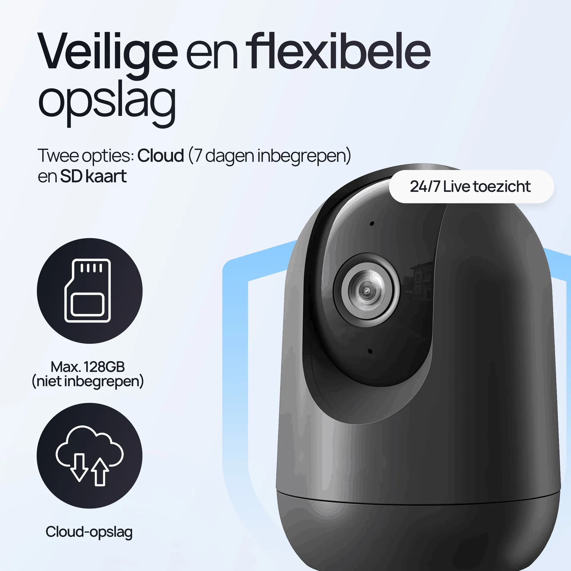
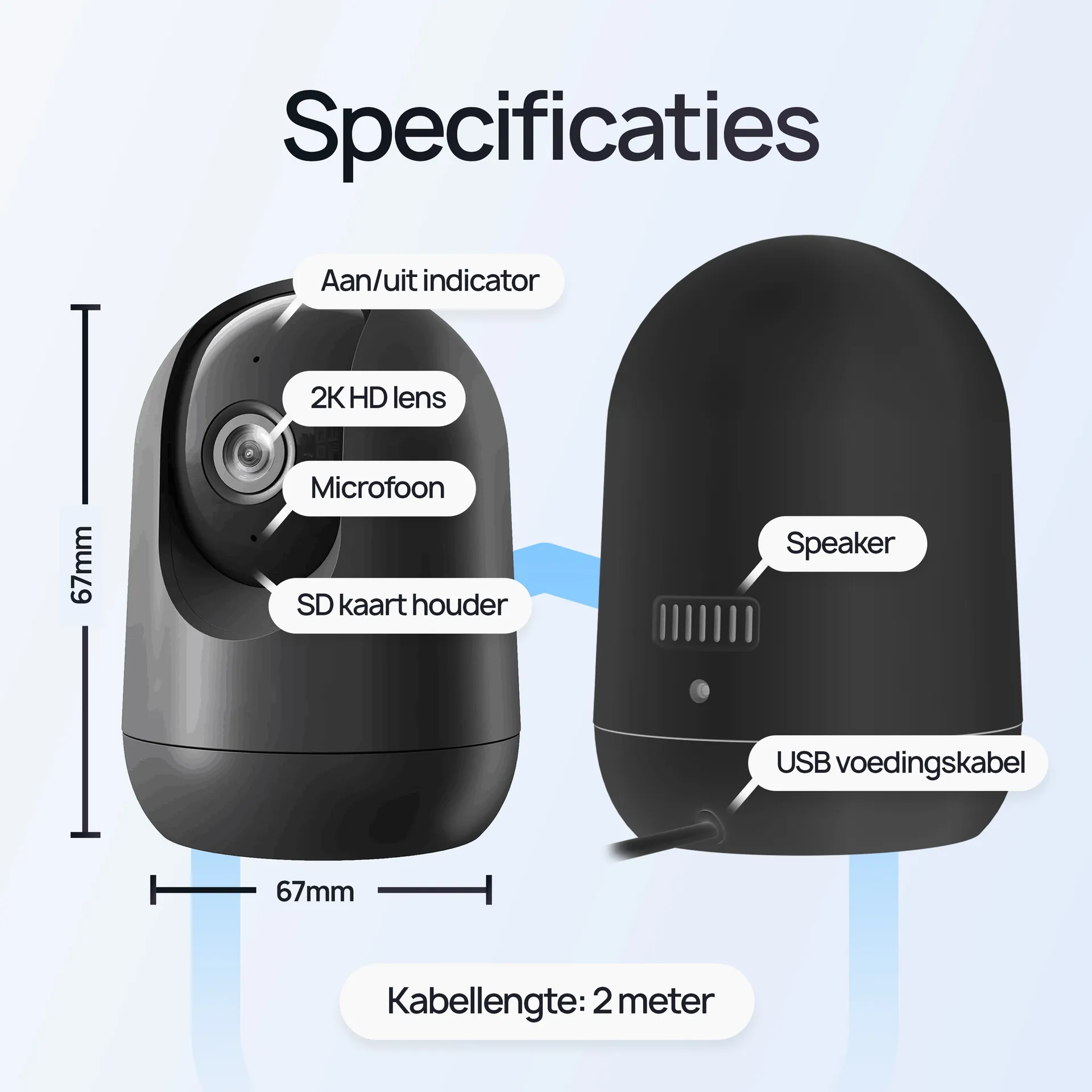
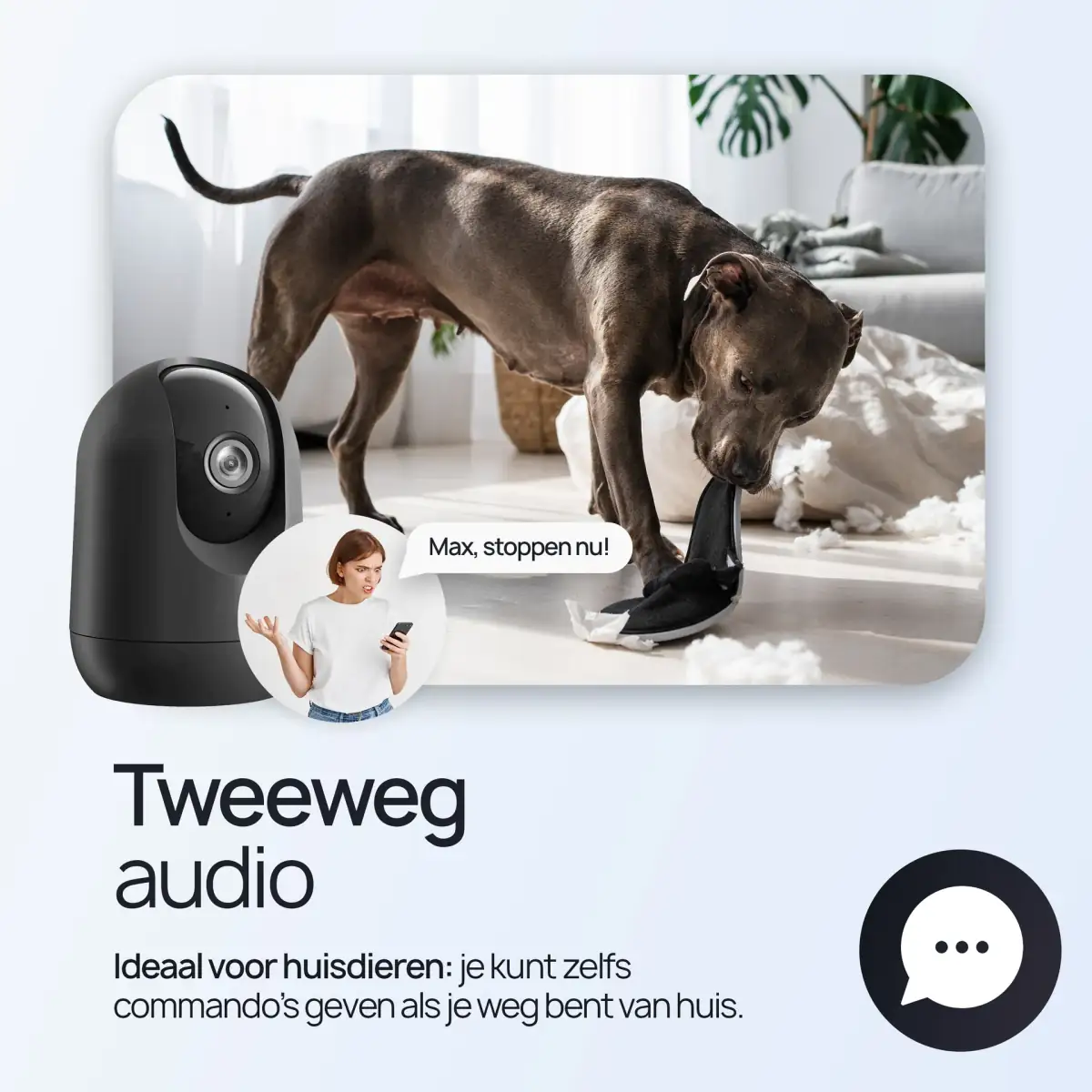
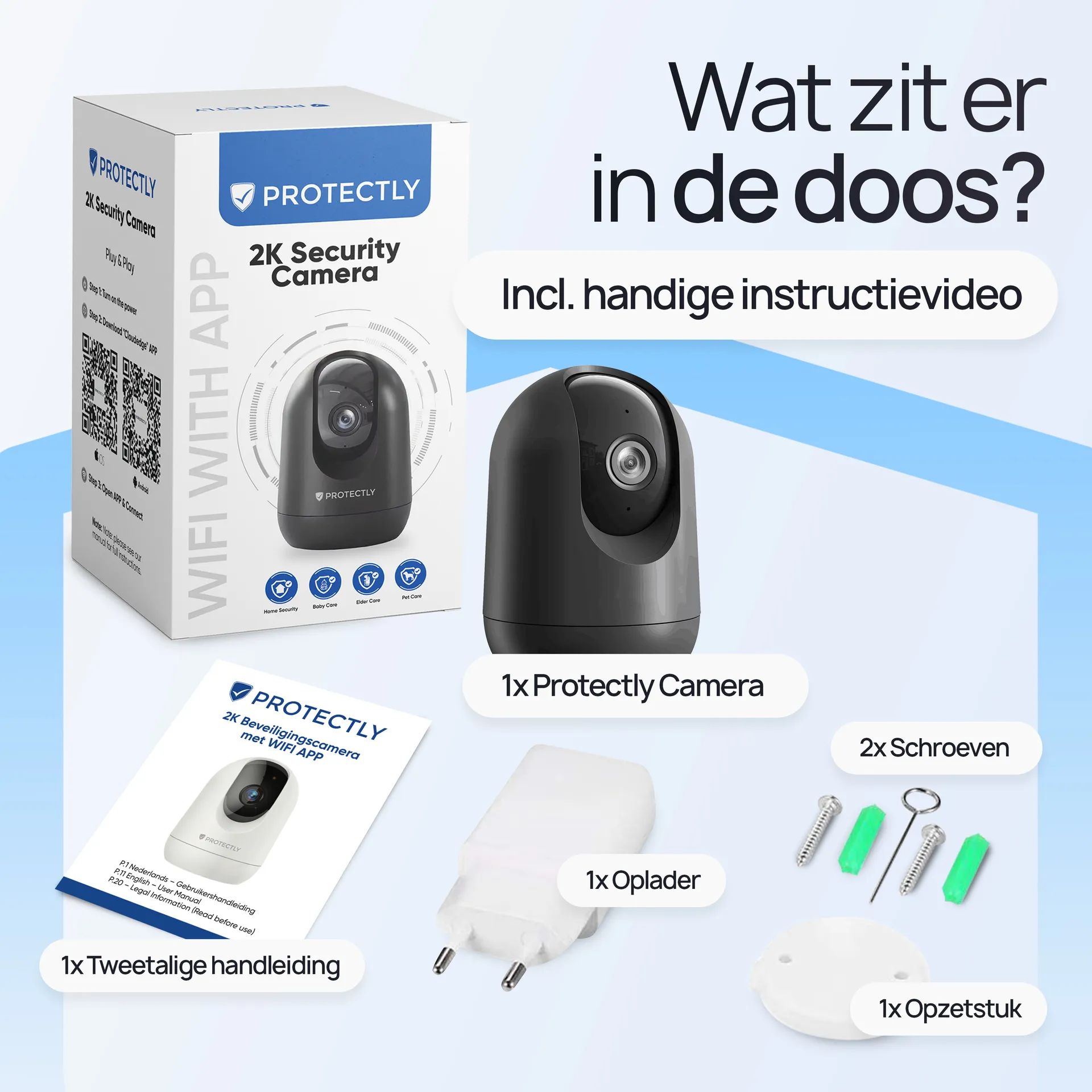
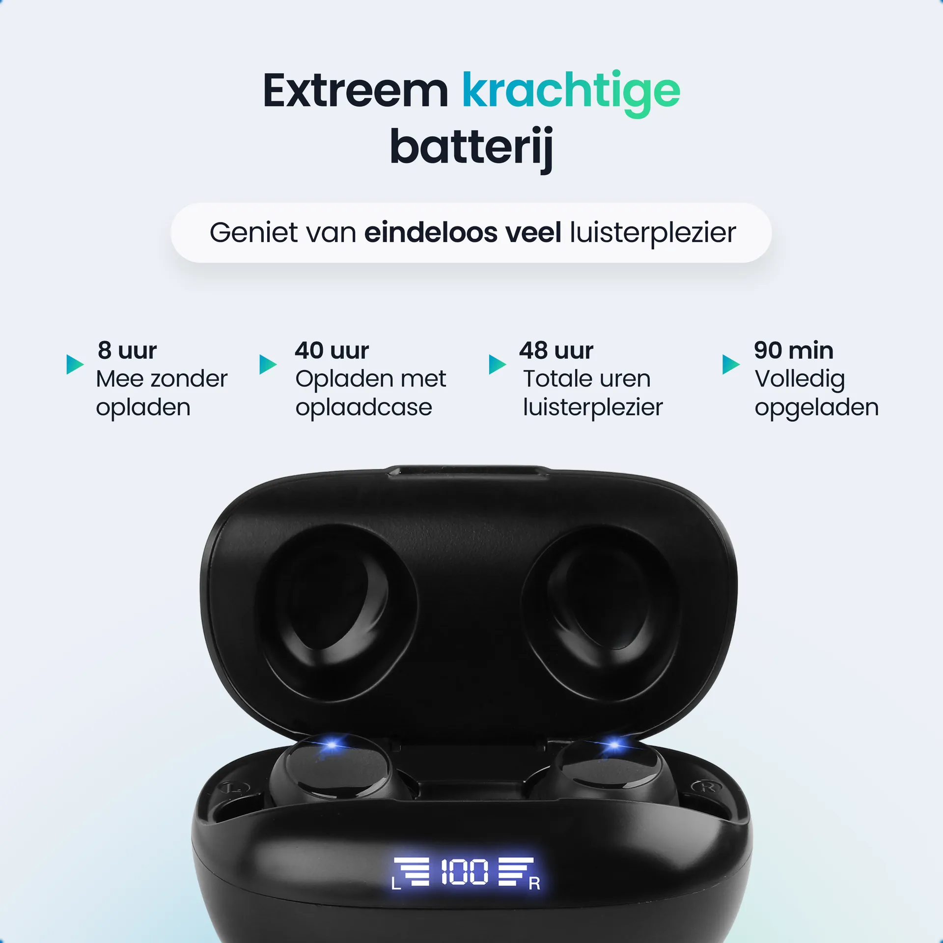
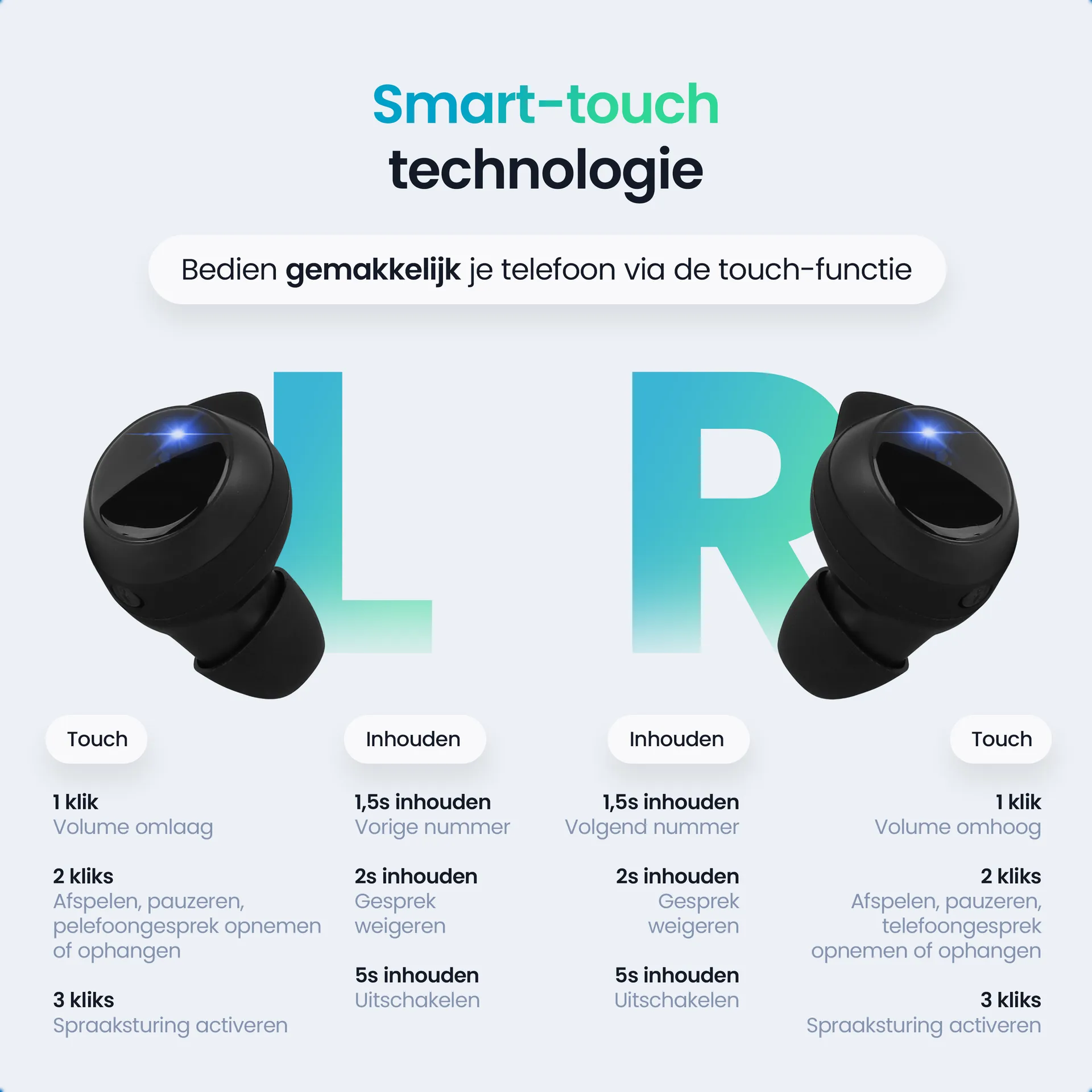
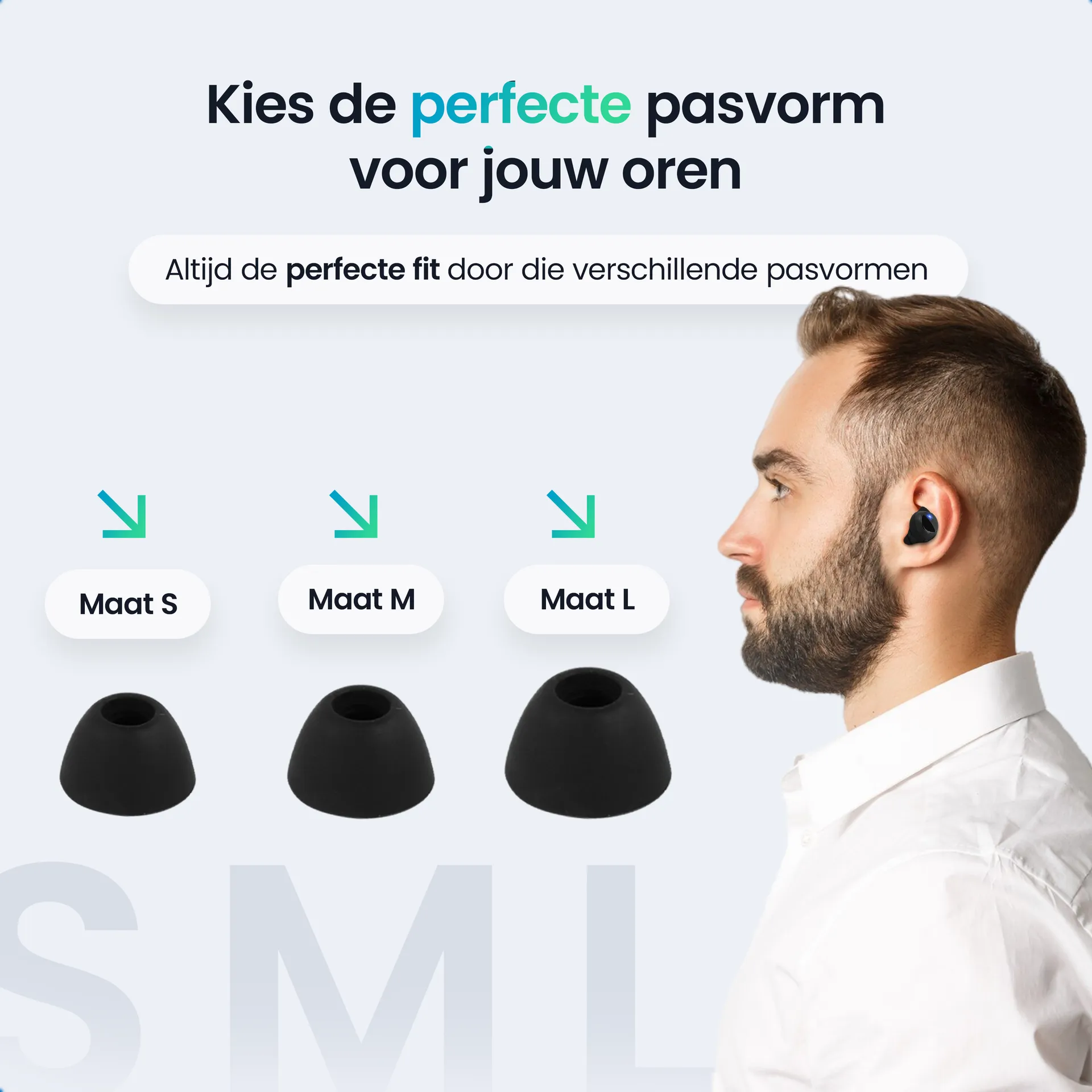
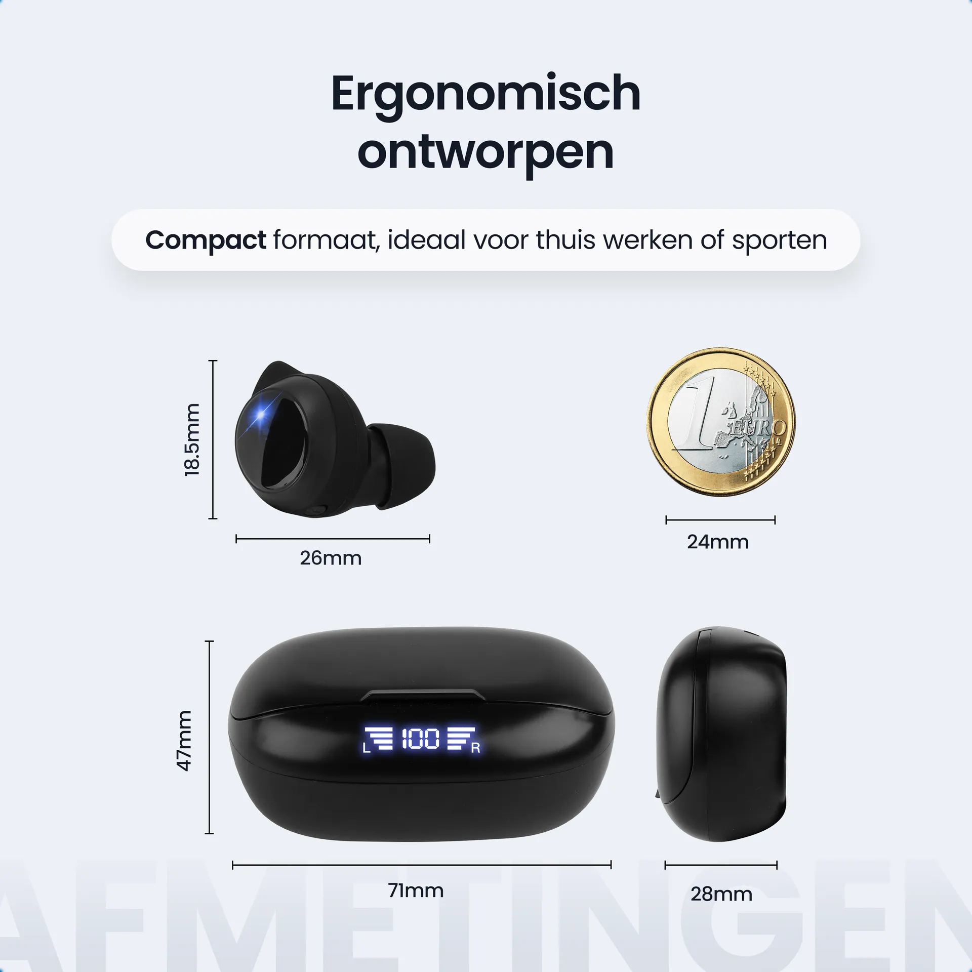
For both Protectly and Siltcon we delivered complete product listing suites for the entire Bol.com and Amazon catalogue. Per product the main image, the lifestyle shots, the infographics, dimension diagrams and the A+ Content on Amazon. Plus a visual guideline document per brand so the client can judge quickly whether new assets are in line with the brand.
For specific launches we also advise on which photographic approach is most likely to convert. For Protectly a businesslike approach with product demonstrations in working environments usually wins. For Siltcon a lifestyle approach with the products in real hunting or nature situations usually wins.
The result
That is the advantage of working with one agency for several brands. The processes are the same, the quality is consistent, but the execution is tuned to what each market asks for. The client has one point of contact for two brands, with the certainty that the visual separation between them is watched carefully.
For entrepreneurs serving several niches through different brands, this is a case of efficiency without loss of quality. Not every brand needs its own creative agency, provided the agency has the discipline to respect each identity on its own terms. That is an organisational challenge more than a creative one, and it is what sets our work with Protectly and Siltcon apart.