Castagnola
Rebranding for a sustainable design brand from 's-Hertogenbosch
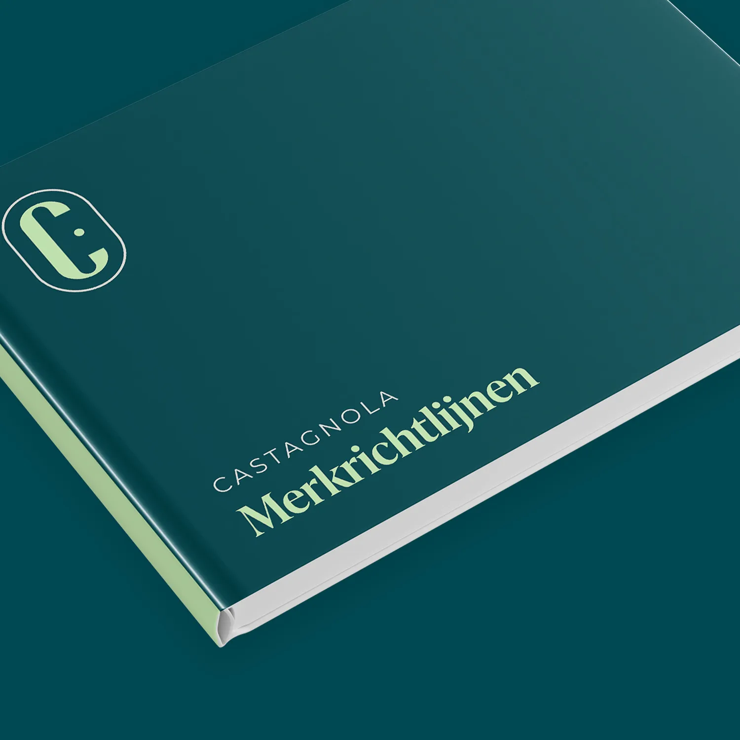
Castagnola had a brand without direction. We did the full rebrand, photography, listings and Shopify store. All on one visual line.
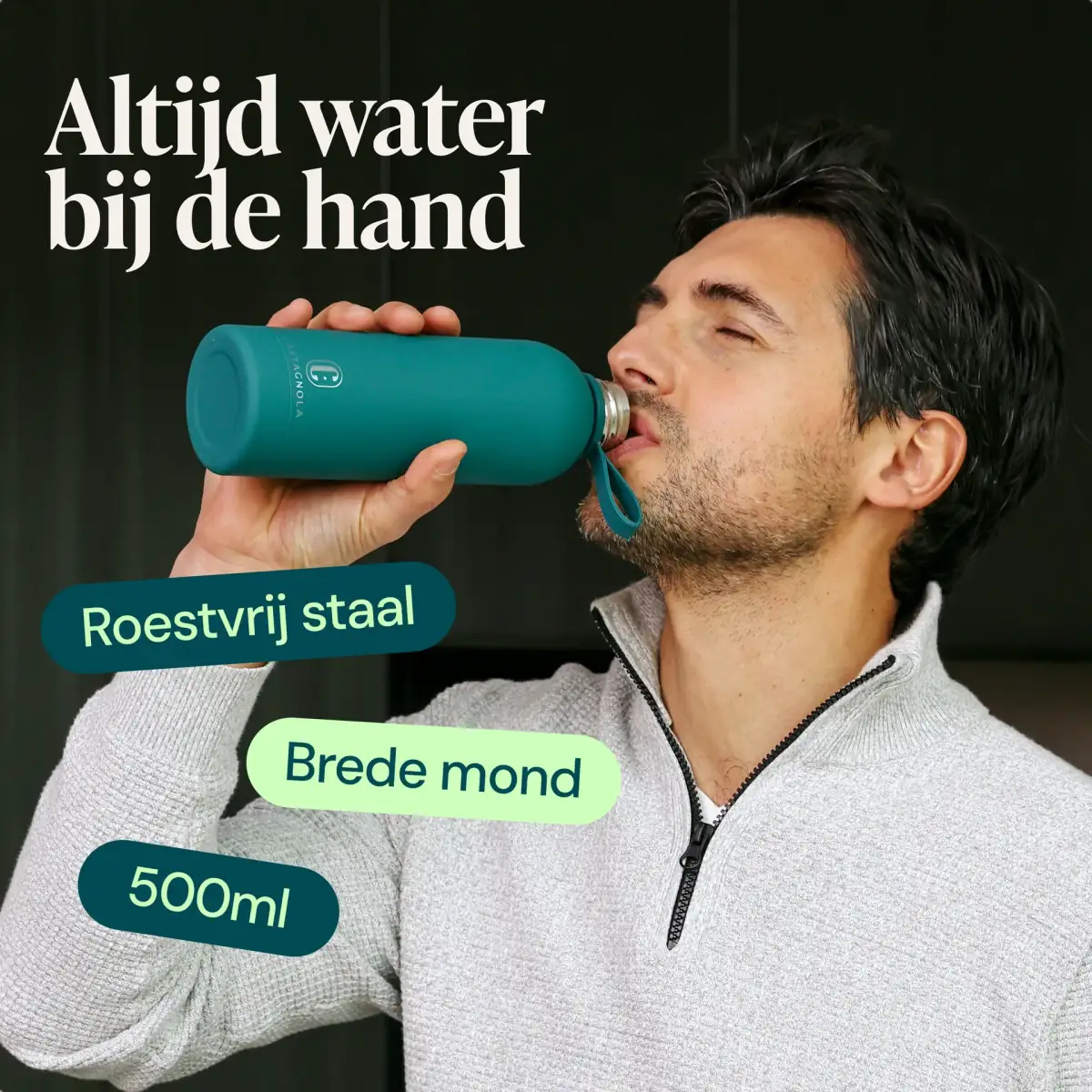
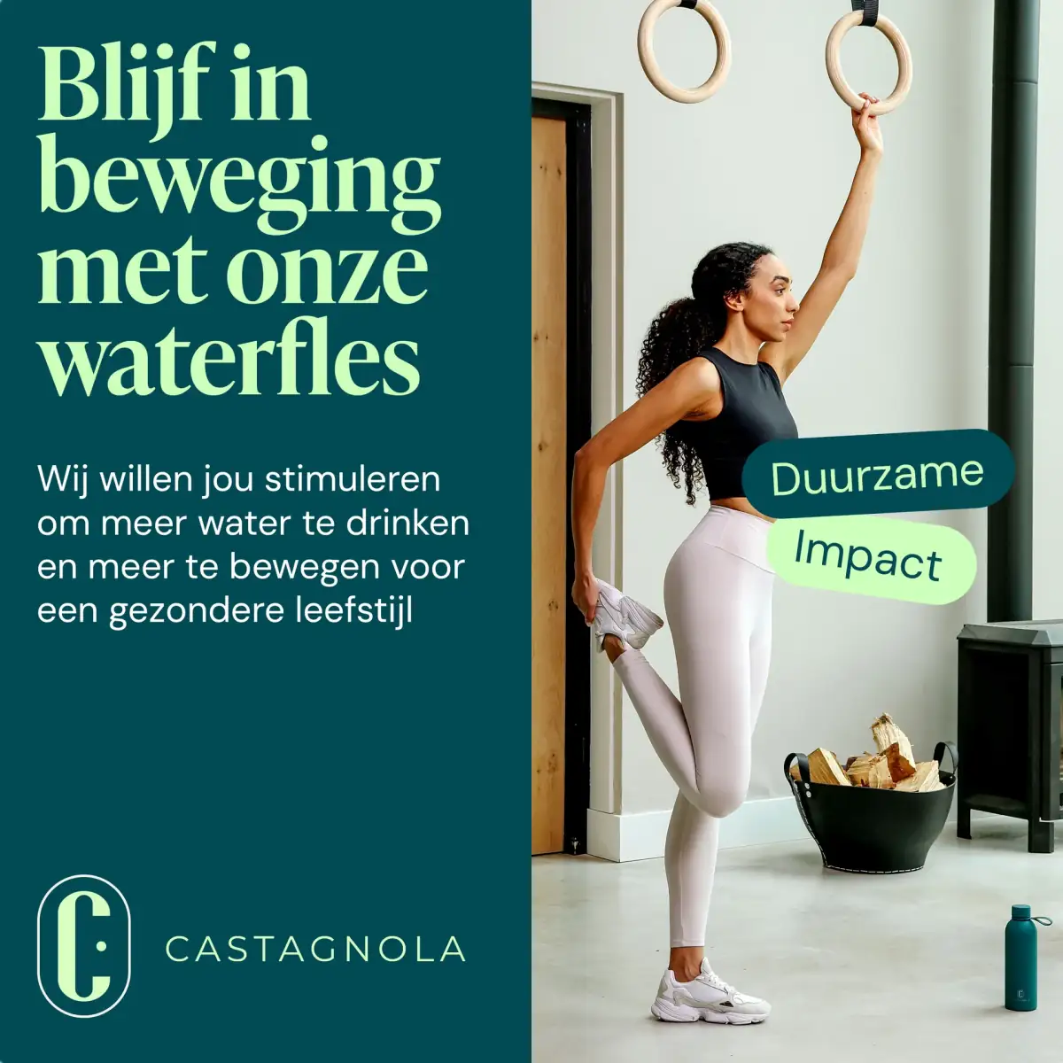
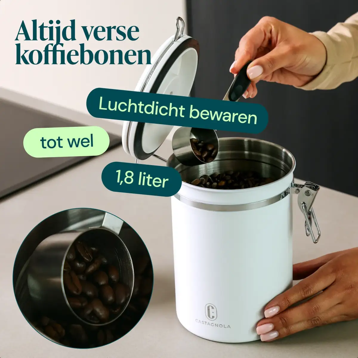
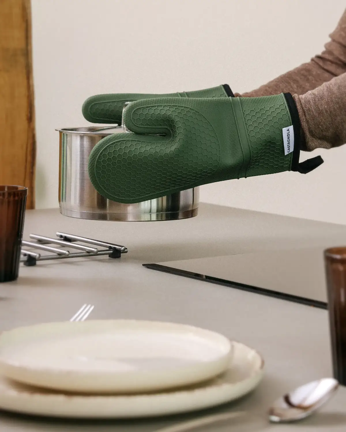
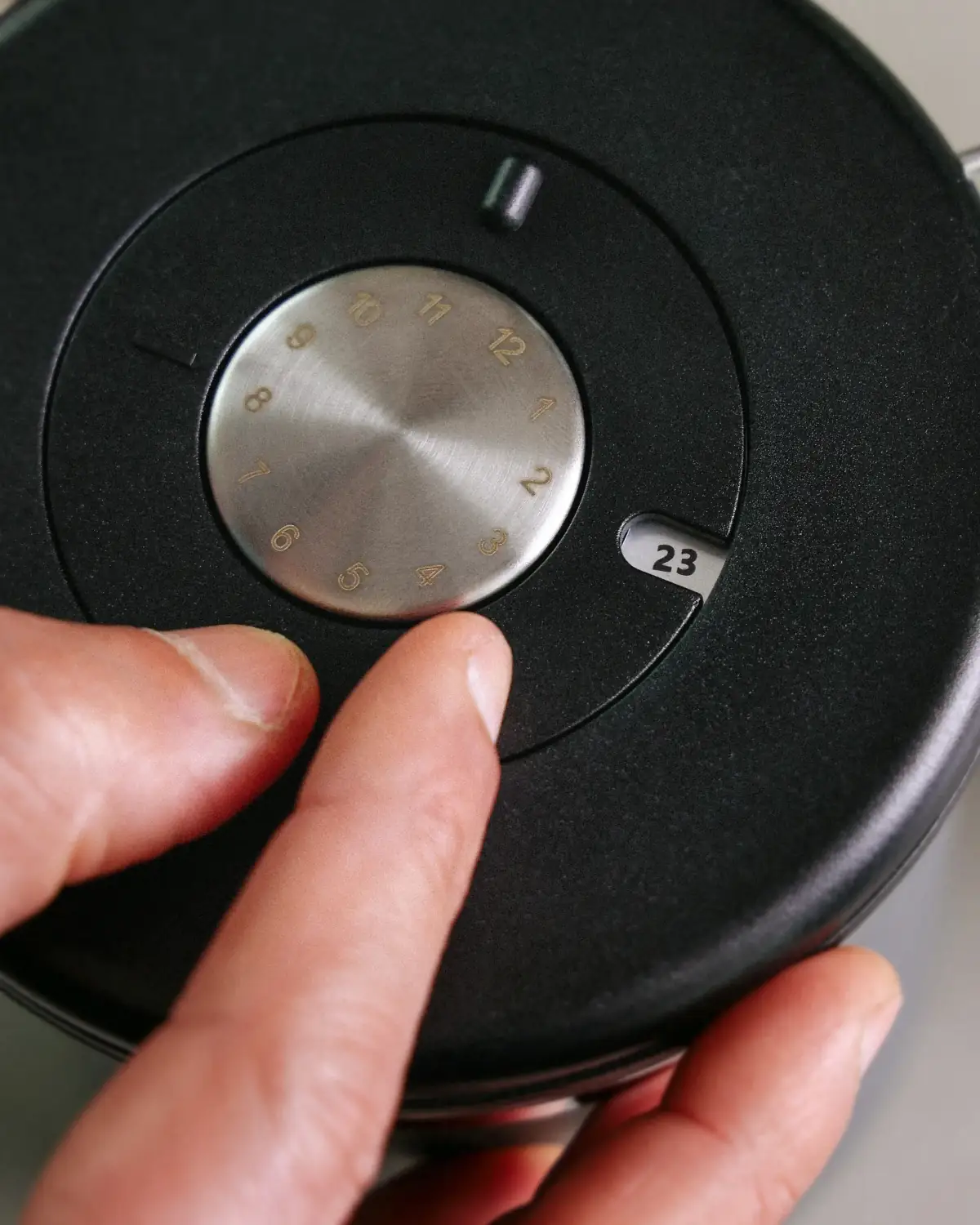
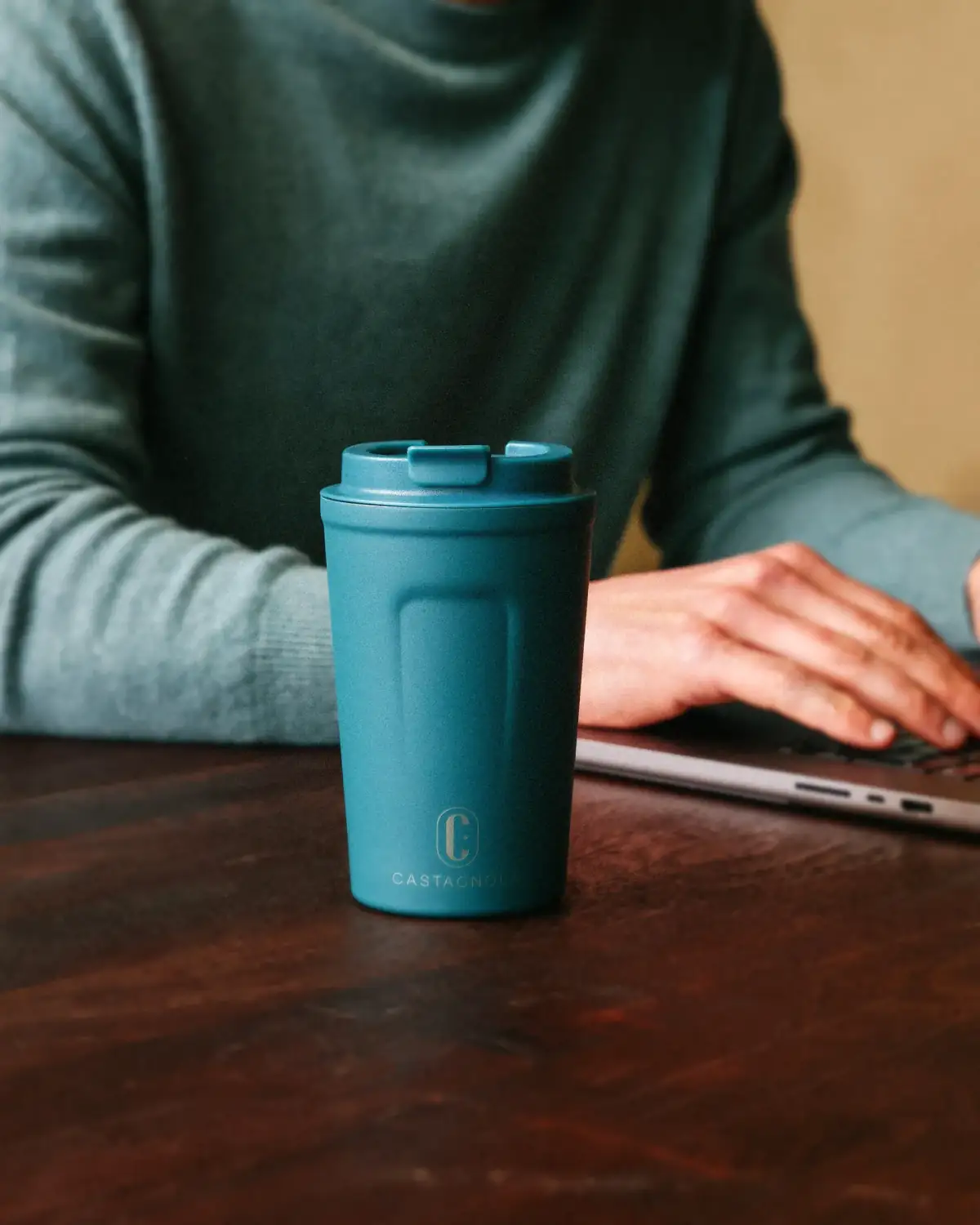
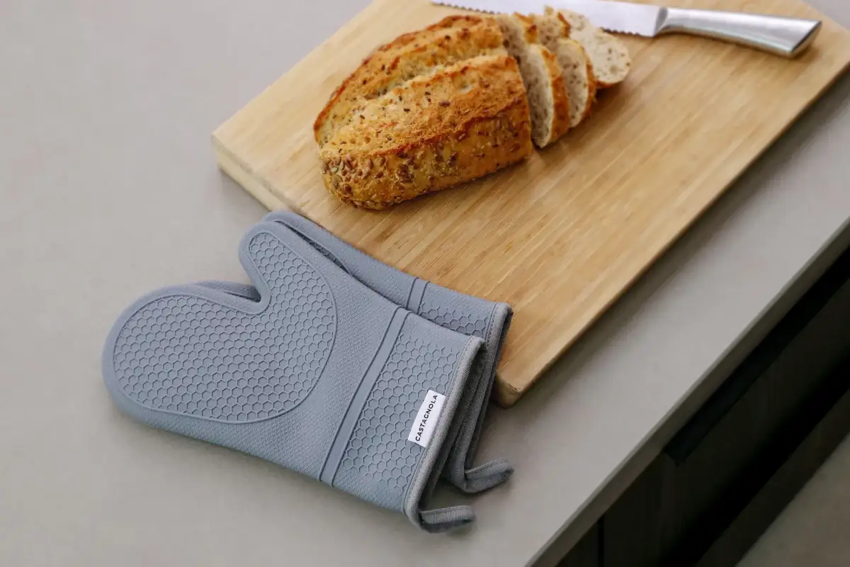
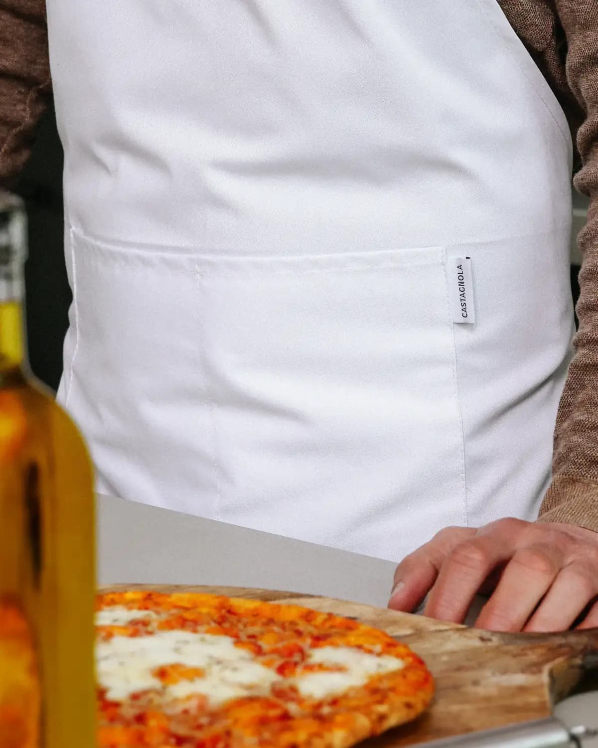
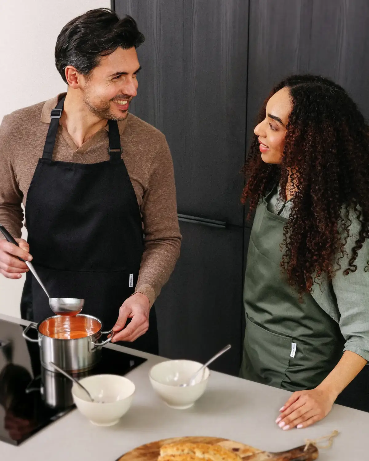
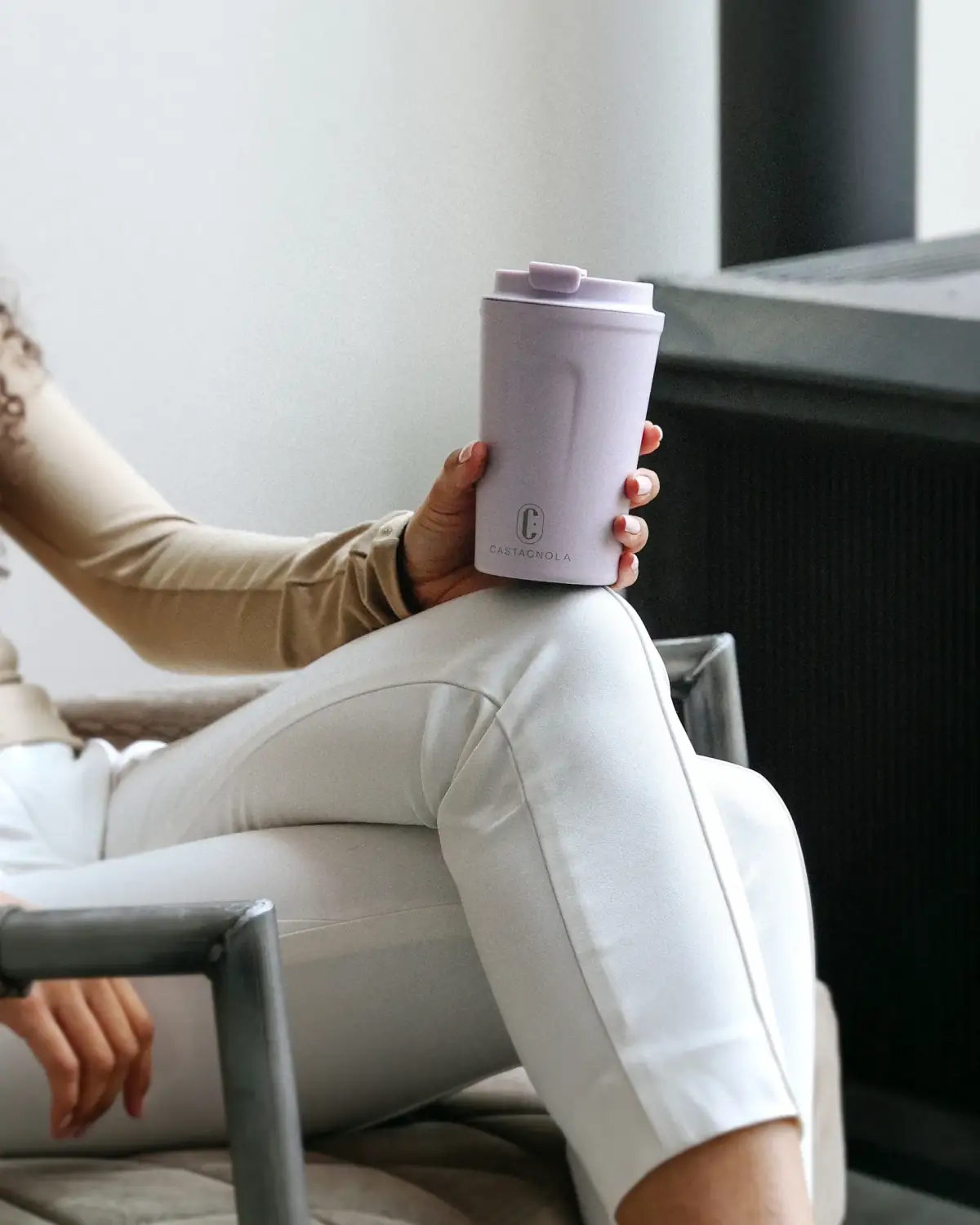
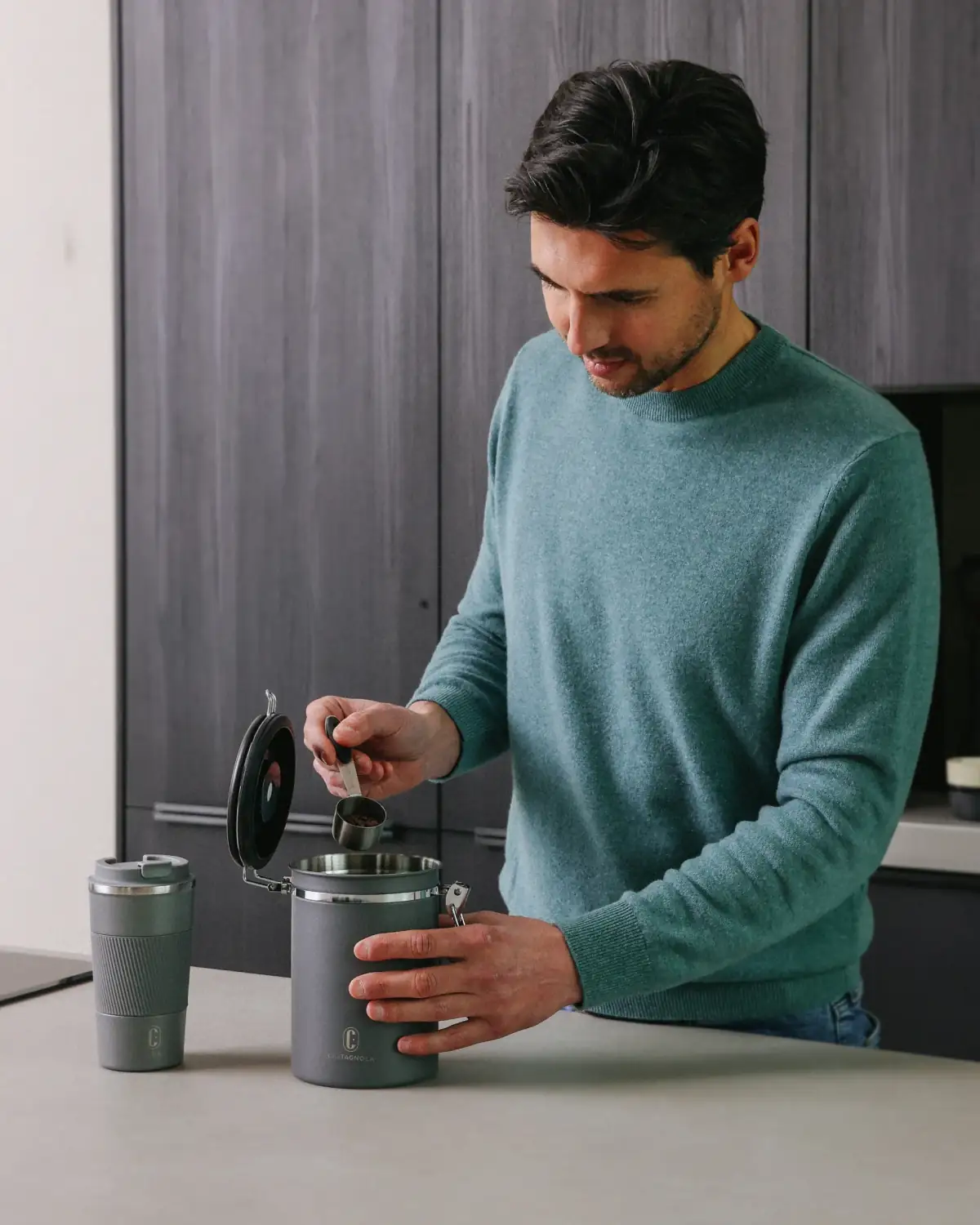
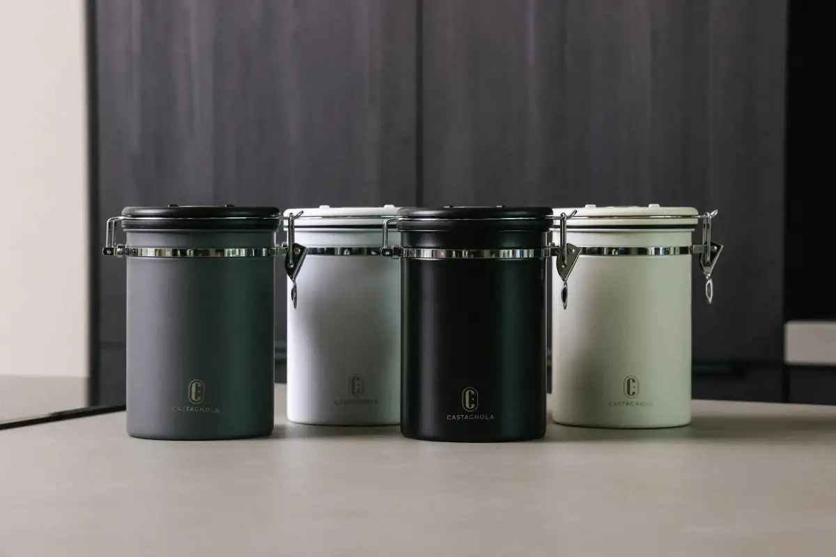
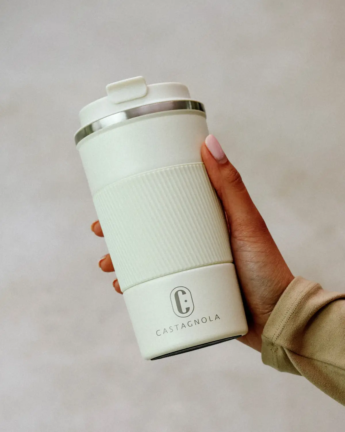
castagnola.nl ↗We did the full rebrand. A brand book that sets the foundation for everything Castagnola releases. Product and lifestyle photography that shows the products as they are meant to be seen: durable design for everyday use.
The brief
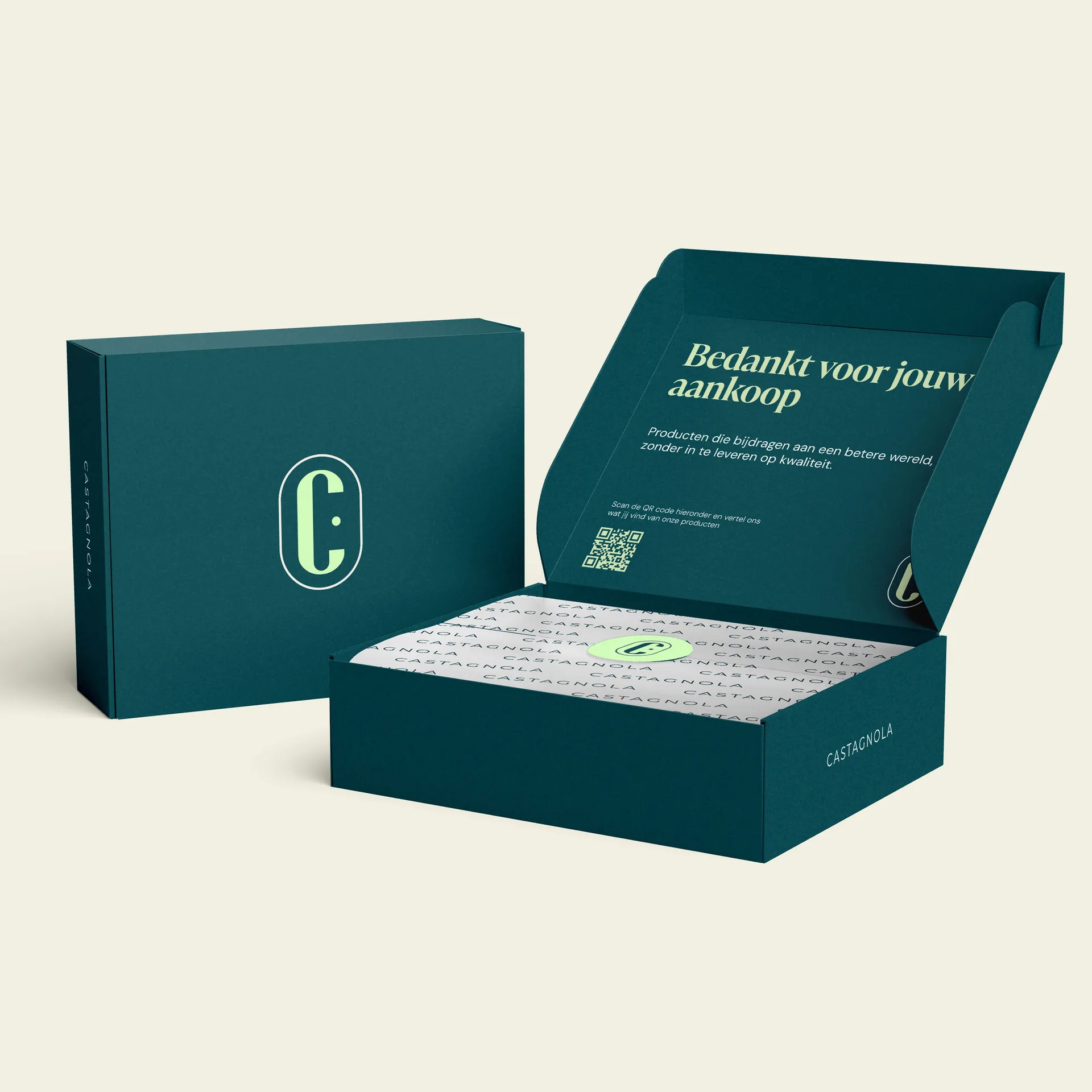
Castagnola already had a brand, but without direction. Stainless steel bottles, thermal cups, placemats, coasters, kitchen aprons and more. Active on Bol.com, Amazon and their own Shopify store. But the brand did not feel like one thing. Packaging did not follow the style of the listings, the listings did not follow the style of the store, and the store did not follow the tone of their social presence.
The question was clear: pull it all into one line. Keep what works, fix what does not, and make sure every new product launch fits the system automatically. No creative experiment per product, but a system that stays consistent as it scales.
Our approach
We started with a brand audit. What does the brand communicate today, what should it communicate, and where are the gaps. On that basis we built the new positioning around durable everyday design, with a visual language that feels warm and well made without turning expensive or pretentious.
Then a complete brand book with logo variations, colour palette, typographic system, photographic guidelines and tone of voice. The brand book is built to be used by third parties without the identity thinning out. An external partner making new content finds every guideline they need for consistent execution.

What we delivered
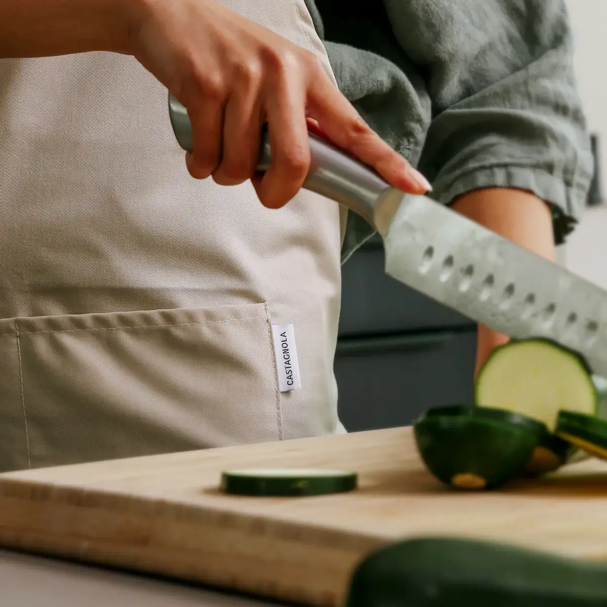
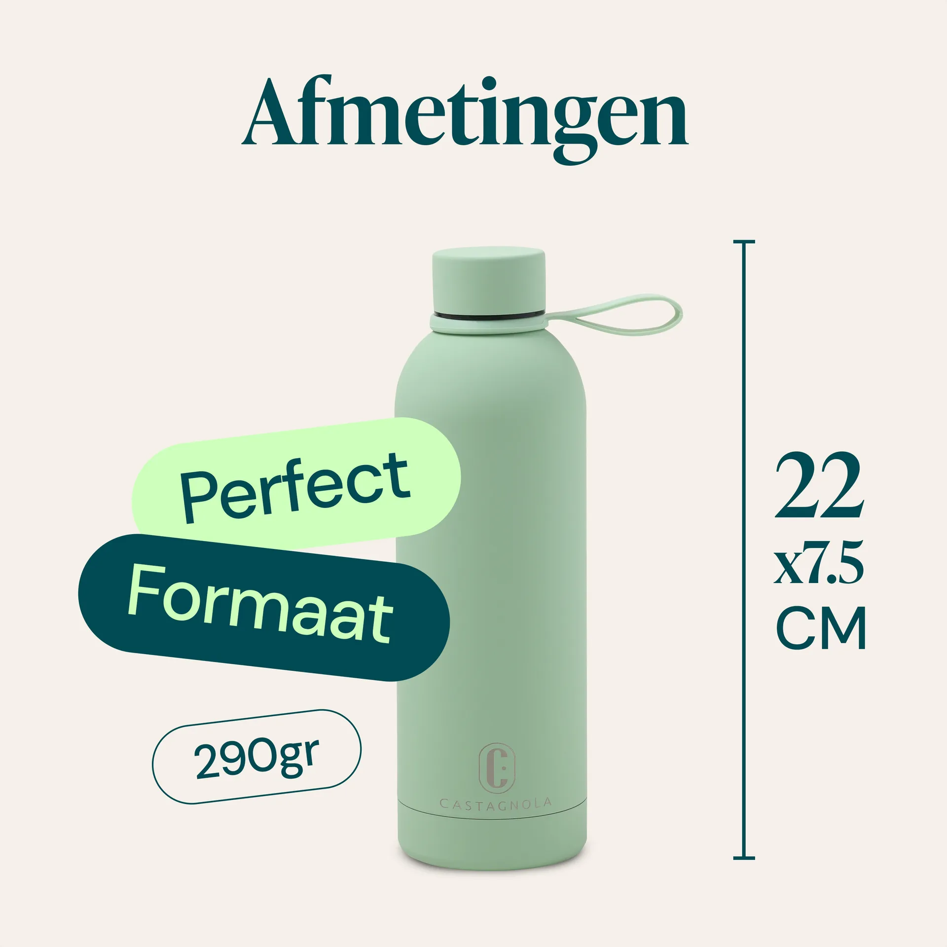
After the branding came the implementation. Product and lifestyle shoots for the entire existing line (steel bottles, thermal cups, placemats, coasters, aprons), product listing design for Bol.com and Amazon to the new brand standards, and a complete Shopify rebuild that brings the store in line with the marketplace presence.
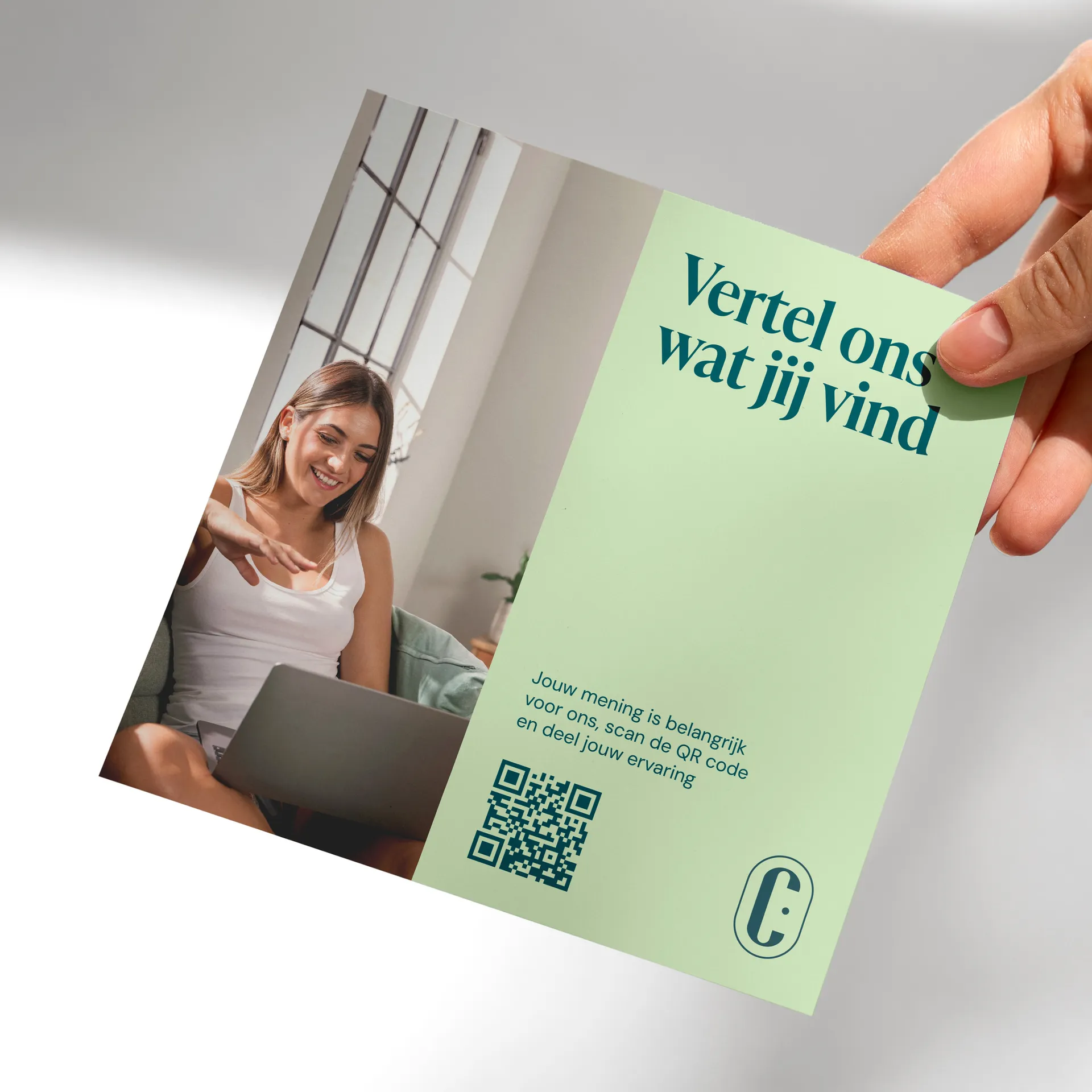
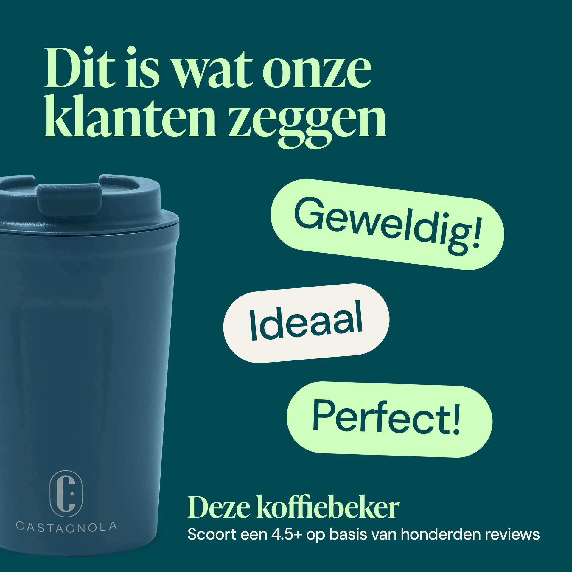
Every touchpoint revisited: Bol.com main images, A+ Content on Amazon, product pages on the Shopify store, social media templates, email templates for Klaviyo. A complete refresh in one seven-week run, with every asset ready for production and upload.
The result
The difference with the old situation: it all holds together now. Packaging, listing, store, photography. One visual language you recognise, wherever you run into Castagnola. Brand clarity is measurably better in customer feedback and repeat purchases, and the average order value on the Shopify store has risen on the back of the premium feel the new identity projects.
Castagnola is now working on more brands in the same style, and every launch builds on the same foundation. The brand book is actively used by both internal marketing and external content makers, and new launches follow the system without us running a briefing cycle each time. That is the difference between a one-off rebrand and a brand system that scales.