
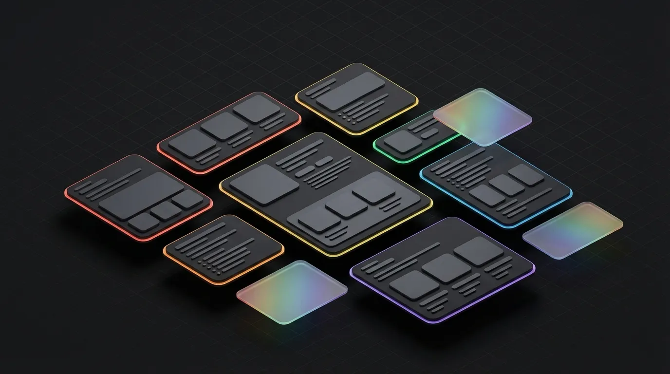
Amazon A+ Content is a free Amazon tool for brand-registered sellers that adds extra content modules below your standard product page. In practice, you replace the generic text description with richer modules: comparison tables, large brand images, infographics, brand-story blocks and (with Premium A+) video and interactive hotspots. Amazon itself cites a conversion lift of up to 8% with standard A+ Content (Amazon Seller Central); for Premium A+, Amazon cites lifts up to 20%.
In 2026, A+ Content is no longer optional for brands that want to scale seriously on Amazon. Sellers who skip it routinely leave 10-20% conversion on the table: a directly measurable revenue effect at comparable ad spend and a comparable product range. And yet most A+ pages we encounter in audits are underutilised, with standard templates, generic copy, and images that aren't aligned with what buyers want to know.
Below you'll read which modules deliver the most impact, when Premium A+ is worth the investment, and the concrete approach for an implementation that actually converts. For the SEO flip side of AI-generated product content on A+ pages, see AI content in e-commerce: why it costs you rankings.
What is Amazon A+ Content?
A+ Content (formerly Enhanced Brand Content) is a set of extra content modules available to brand-registered sellers on Amazon. You replace the standard product description with richer content: larger images, structured text, comparison tables and video.
The goal is straightforward: inform the buyer better, present the product better, and remove doubt before someone clicks away.
A+ Content is separate from your bullet points and product images at the top of the page. It appears lower on the product page, but it's precisely the section where buyers end up when they're seriously considering a purchase.
There are two variants:
Standard A+ Content, available to all brand-registered sellers. Offers modules for text, images, comparison tables and featured headers. Conversion lift: up to 8% according to Amazon's own data (Amazon Seller Central).
Premium A+ Content, since May 2026 free for all brand-registered sellers, provided each ASIN has a published Brand Story. The old revenue threshold and qualification requirements are gone (Amazon Seller Central). Adds: interactive hotspots, autoplay video, expanded comparison tables and Q&A modules. Conversion lift: sellers report outliers up to 20% in practice.
| Feature | Standard A+ | Premium A+ |
|---|---|---|
| Availability | All brand-registered sellers | All brand-registered sellers (with a published Brand Story) |
| Modules | Text, images, comparison table, header | Everything from Standard + hotspots, video, Q&A |
| Video | No | Autoplay video |
| Interactive elements | No | Hotspots, hover effects |
| Average conversion lift | Up to 8% | Up to 20% |
| Production costs | Low-medium | Medium-high |
| Lead time | 1-2 weeks | 3-5 weeks |
Which modules deliver the most return?
Not all modules perform equally. Across our clients we consistently see the same modules come up when it comes to measurable conversion impact.
| Module | Average conversion effect | Best use case |
|---|---|---|
| Comparison Chart | 8-12% | Products with variants or competing alternatives |
| Interactive Hotspots (Premium) | 5-10% | Complex products with multiple features |
| Enhanced Header Image | 2-5% | Brand building, visual differentiation |
| Text + Image Modules | 3-7% | Any product category, benefits communication |
| Autoplay Video (Premium) | 6-12% | Products that require explanation or demonstration |
Comparison Chart Module
The comparison table is in practice the strongest single module in A+ Content (Jungle Scout Marketplace Report).
Why it works: buyers who are seriously considering always compare. They open tabs, search reviews, look at competing pages. A comparison chart pulls that comparison back to your page. You control which dimensions are compared, and you emphasise precisely the points where your product wins.
Don't use this module only to compare variants of your own product. Also compare product categories: "when do you choose product X versus product Y?" That gives buyers context and builds trust.
Interactive Hotspots (Premium A+)
Available in Premium A+. Buyers click on specific parts of a product image to see more information. Effective for products with multiple features that require explanation: electronics, furniture, outdoor equipment.
It increases the time visitors spend on the page. More engagement, lower bounce rate, and Amazon's algorithm registers that.
Enhanced Header Image
The header at the top of your A+ block is the first thing buyers see when they scroll down. Use this space to establish your brand identity, not to list product features, that comes later.
A strong header works as the bridge between the product photos at the top and the detailed explanation below. Branding first, features second.
Text + Image Modules
The backbone of your A+ Content. Most sellers use too much text and too little visual context. The right ratio depends on your product, but the rule of thumb is: let the image do the heavy lifting, and use text to confirm what your image shows.
Write benefits-first. Not: "This product features a double-walled stainless steel construction." Instead: "Keeps drinks cold for 24 hours, even in direct sunlight." The feature is the same, the relevance to the buyer is far more concrete.
When does Premium A+ Content justify the investment?
Since Premium A+ became free for every brand-registered seller in 2026, the only remaining barrier is production quality. Still, Premium A+ isn't the right choice for everyone. Production is more intensive: you need video content, interactive elements require more design and implementation time, and you need to meet Amazon's quality standards.
The investment pays off fastest in three situations:
High order value. For products at 80 euros or more, the purchase threshold is higher. Buyers want more certainty. Premium A+ provides that certainty through video and interactive explanation. If you want to see the same pattern on the Dutch marketplace, read our overview of optimising bol.com listings.
Complex products. Electronics, fitness equipment, kitchen appliances, furniture, products where the buyer has multiple questions that a photo can't answer. Hotspots and video are directly relevant here.
Multiple variants. If your product comes in five colours and three sizes, an interactive variant display is far more effective than a static comparison.
An internal Oase Creative case we analysed: a seller in kitchen equipment saw a 17% conversion increase and a 12% rise in repeat purchases over 60 days after implementing Premium A+ with autoplay video and a comparison chart (internal analysis, 2025). The repeat purchases are relevant here: better content enables buyers to make a more informed decision, which leads to more satisfied customers and more returning behaviour.
For clients who have both product photography and A+ Content produced through Oase, we see that the combination of professional imagery and considered module layout consistently outperforms handling those elements separately.
Best practices for A+ Content in 2026
Mobile-first is not optional
The majority of product page visits on Amazon happen on mobile. Amazon Seller Central has a built-in mobile preview, use it every time before you publish.
Specific mobile considerations:
- Text in images must be readable on a 6-inch screen
- Heavy images (over 1MB) slow load times on mobile
- Comparison tables can compress on mobile, test this explicitly
Alt text as an SEO tool
The text in A+ modules themselves is not indexed by Amazon's search algorithm. But alt text on images is. This is an underutilised opportunity.
Write descriptive alt text that includes your primary search terms. No keyword stuffing, write the alt text the way you'd describe the product to someone who can't see the image. That's good for both SEO and accessibility.
Unique content per ASIN
Don't copy A+ Content from one product page to another. Amazon detects this and may rank duplicates lower or reject them. Write unique content per product that addresses the specific use cases and questions that apply to that product.
Benefits-first writing
This is the most common mistake in A+ Content: sellers write from the product's perspective, not the buyer's.
Framework that works:
- Problem or situation the buyer recognises
- How the product solves it (concrete benefit)
- The feature that enables the benefit
- Social proof or confirmation (star rating, case study, data)
Avoid the following: marketing language without substance. "Highest quality", "perfect for everyone", "number 1 choice", this says nothing and buyers skip it.
No keyword stuffing
A+ Content is content for people, not for algorithms. Stuffing reduces readability and leads to rejection by Amazon's review team. Use search terms where they fit naturally in context, not as a goal in themselves.
How does A+ Content work together with the rest of your listing?
A+ Content doesn't stand alone. It works in combination with the rest of your listing.
Your product images (the images at the top of the listing) are the first impression. They determine whether someone clicks through from search results. A+ Content determines whether someone converts after they've clicked. Read more about product photo requirements in our article on Amazon product photo requirements in 2026.
Your bullet points are the scan layer, the five lines buyers read when they want to decide quickly. A+ Content is the depth layer, for buyers who want to know more before they purchase.
The strongest listings have a clear flow: the title answers "what is this?", the images answer "what does it look like?", the bullets answer "what are the key benefits?", the A+ Content answers "how does it work, who is it for, and why should I choose this over alternatives?"
If any of those layers is weak, it undermines the rest. A strong A+ implementation on a listing with poor product photos doesn't convert. The reverse is equally true.
More on listing optimisation on our product listing design services page.
Common mistakes with A+ Content
Too much text, too little imagery. A+ Content is a visual medium. If you have more lines of text than images, you're doing it wrong.
Reusing generic copy. If you paste the same A+ Content across ten products, it performs worse than ten specific implementations, and Amazon detects the duplicates.
Skipping the mobile preview. Nearly every listing we see has mobile issues the creator didn't check. Desktop looks fine, mobile is a mess.
Leaving out the comparison chart. This is the strongest module, and at the same time the one that takes the most effort to get right. Many sellers skip it. That's a mistake.
Waiting for perfect content. A good A+ implementation now is better than a perfect implementation six months from now. You can always iterate based on data.
A+ Content is no longer a nice-to-have
In 2026, A+ Content isn't optional, it's part of the minimum standard for any serious Amazon seller. The shift we're seeing this year: sellers without A+ Content aren't just losing conversion, they're losing position. Amazon's algorithm weighs content completeness increasingly heavily in ranking, and listings without A+ are noticeably falling behind competitors who use it well in search results.
Start with the Comparison Chart Module, the highest return per hour invested. Write benefits-first for all text modules. Optimise alt text with relevant search terms. And always test on mobile before you publish. Premium A+ is the logical next step once your order value or product complexity justifies it.
At Oase Creative we help brands with full listing production: from Amazon A+ Content design and product photography to the complete product listing design for Bol.com and Amazon.
